Pazzles Bar

Get the Pazzles Inspiration, the most comprehensive electronic die cutter available, for as little as 99 dollars down.

Tuesday, April 30, 2013

Embossed and Ribbon Friendship Card


For this card, I knew I wanted to do two things. I wanted to color, and I wanted to use this ribbon, which I bought over 20 years ago, when Wright's Trim still had their outlet store in Massachusetts.

Anyway, I really liked this lavender ribbon with the woven roses. I mounted it onto a card which was embossed with a Spellbinders M-Bossability, and matted with a lilac colored card. The embossed layer is Core'dinations Pearl.

I had a specific JustRite stamp in mind for this card, but I can't figure out what I did with it. I've looked every where, and the only thing I can think of is that I got it mixed up with the paper the last time I used it, and it is somewhere in a paper stack. I have too much paper, so I still haven't found it. Luckily, the whole set is missing, which means I had cleaned the stamps I used from the set and put them back in the package, so it will be easier than trying to find one little clear stamp. Anyway, I used this JustRite stamp instead. It was stamped on more pearl CS with VersaMark, and embossed in gold. I was planning on using Copics on it, but my purples were the wrong shade, so I used Gel pens instead.

I fussy cut around the stamp and mounted it dimensionally, then used a gold GellyRoll to accent everything. The card was finished with a little bow and some Liquid Pearls.

Monday, April 29, 2013

Oval Cameo Card


I finished this card very late last night.

The card is made using Spellbinders Floral Ovals. I wanted the card to be shaded with Brilliance Rocket Red Gold and Delicata Golden Glitz, but the red gold wasn't quite gold enough, so I shaded over the top of it with the Golden Glitz, and it gave a really pretty pink gold shimmer. I wish it showed in the photo.

The card is embellished with a pink pearl, some gold Liquid Pearls, a Cameo from my stash, and a string of tiny gold pearls for a frame around the cameo. All the dies were outlined just inside the die with a gold Gellyroll pen.

Saturday, April 27, 2013

Yellow Irises Card


This is another card I made in spurts while helping my mother. I took two photos of it because it's hard to get the effect of the shimmery papers. The card looks different from either of the photos, because it's shimmery and flat at the same time. The flowers in the background paper also make the iris look a little weird in the photo because of the way they capture the light. In person it is an interesting effect.

When I started the card, I knew I wanted to use this MS PATP which I only used once, so I cut out a 5" sqauare with it. Then, I had some of this pretty Hana Fubuki origami paper, and decided I wanted to make a pretty springlike card in green and yellow.

I cut the inside square with green, then the outside one with yellow. I knew I wanted to mat it with a shimmery spring green and yellowy gold, so I went around the smaller mat with some spring green PearlEx paint I had made. I didn't realize the color shift would be so much, and sometimes it was a pretty green, but at others, it was a brown gold, so I went over the PearlEx with a green Copic, and it stayed a nice shade of shimmery green with only a little color shift. For the next mat I used paint made from PearlEx Sparkle Gold.

When planning the card I had also decided to use a Spellbinders Floral Oval for whatever I would put in the middle. I decided on one of my favorite JustRite stamps, this iris. I stamped it onto the yellow origami paper with Memento Bamboo Leaves, and embossed it with clear EP, then colored it with Copics. I cut the iris with a Spellbinders oval which was as large as the floral oval, then cut the floral oval out of white CS. After cutting that, I cut the center out of the floral oval with a smaller oval so it would be an open frame, and mounted it over the iris layer.

Last, I went around everything with my Gellyroll pen, and accented it with two Prima flowers and some Liquid Pearls.

Friday, April 26, 2013

You touched my Life Card


Still really busy with my mom, but I worked on another card in between everything. I started this one early this morning, and finished it after dinner tonight. I'm afraid it's not one of my better ones.

I've had the DP for a number of years now, and always wanted to do something with it, but I didn't really know what I wanted to do. It was a 12x12 sheet with a bluish, greyish, greenish frame and flowers in two corners, and is linen textured. I cut the top corner to 5.5 x 5.5 and matted it with matching solid colored linen textured card stock.

The sentiment is from JustRite, and is stamped with VersaMagic Olive ink. It was cut and matted using Spellbinders Squares and Marvelous Squares. My gold pens are all empty, and the stores where I get them are two hours away, so I had to used my gold Gellyroll pen to accent it. The pen is pretty, but you can't get thick enough lines for it to show up well. I went around all the dies and paper layers with it, as well as tracing inside the dies.

I wasn't really sure how to finish this card, and dinner was almost finished cooking, so I quickly added a bunch of Liquid Pearls. I shouldn't have rushed so, because they didn't come out very even. I wasn't really sure what to put in the blank space in the bottom corner, and I got the pearls too close together. After dinner, I added a bow, which actually is almost the same color as the paper, but the lighting and the phone's flash made it look like it is bright green.

Tomorrow, when the Liquid Pearls are dry, I will probably go over some of the smaller ones to make them match better in size, and look straighter.

I don't really dislike the card, it is quite different from most of my cards, and it will probably look better when I straighten out the pearls, but it's not my favorite.

Thursday, April 25, 2013

Fish and Coral Card


I'm still really busy helping my mother, so I didn't get a card made today. This is one I made last summer that I never uploaded.

The DP is from K&Co. It was outlined with gold, matted with dark green CS and mounted onto a white card. The fish is also K&Co and was mounted dimensionally.

The sentiment is from JustRite and was stamped with black and embossed with clear EP, then cut with a spellbinders die, shaded with blue ink, and accented with gold. It was mounted dimensionally a little bit higher than the fish.

Wednesday, April 24, 2013

Purple Flowers and Lace Card


Today I still had a lot to do, but I was having severe withdrawals from creating, so I did this card in little bits all day long. Sometimes that's not a good idea, because when I went to photograph it tonight, I realized that I put the sentiment on in the wrong direction!!! Right now, the card's fold is on the bottom! Luckily all I will have to do is cut the card on the fold and attach it to a new card, and it will be fine.

I had no idea what I was going to make for a card, so I went through some of my older papers, and found one that had lilac photographs all over it. I decided to frame the lilacs with this MS Punch Around the Page, so it would look like an old fashioned hanky under the lilacs. After mounting the lilacs, and matting everything with plain lilac paper and gold mirror card, it looked like there was too much white, so I shaded it with Brilliance ink, and liked it better.

I went around the lilacs with a gold Gellyroll pen because my PenTouch pens are pretty empty, then decided to color in the punched flowers with the same gold.

The sentiment is from JustRite, and was stamped with VersaMark and embossed with gold EP, then cut with Spellbinders Labels One. It was also shaded with the same Brilliance ink and mounted dimensionally onto a little doily cut with Decorative Labels one.

Last, I added some Prima and Recollections flowers, and some leaves I punched with a McGill punch. I wish I had done more to the leaves, but by that time, I was late starting dinner, so I just added gold to them. I also kind of messed up the sentiment by trying to outline it with my almost empty PenTouch pen.

Last I added Liquid Pearls, and tried to photograph it. That's when I found out the fold was on the bottom. It could have been worse though, the card is really very pretty in person.

WOYWW 203

We have been busy moving my mother, so there is nothing on my workdesk today.

My favorite part of snooping is seeing what everyone has for goodies, and how they store it, so I thought I would let you see most of my collection of Spellbinders, a few of my Marianne Dies, and a few Cheery Lynn dies, and how I store them. I have more, but I ran out of magnets, so they are still in notebooks.


All except the last photo are magnets mounted onto those cube things you get at Michaels. I just took whatever I had for magnets and attached them either with push pins, or double sided tape. These are temporary, since I move to our summer gift shop as soon as the weather warms up, and I will have to organize them all over again.

The bottom photo is a foam core board with magnets on it. I really like being able to see most of my dies, and being able to hold them over each other to see what works and what doesn't for mixing and matching. This would be a great system if I didn't have to keep moving everything. I would really like to completely cover a big surface like a door with magnets so I could display them all! In the second row of photos, you can see all of my flower dies organized together. In the first row, I have a side that is mostly the Spellbinders motifs and accents type sets.

I think where I have to move everything a few times a year, I may get more foam core and more vent magnets so they will be easier to move, then organize all my dies according to type, rather than having them on the sides of the cubes.

Anyway, if you have enough room, this is a really easy way to use your dies, and always be able to easily see what will fit with your projects!

If you don't know what WOYWW is, go on over and visit Julia at The Stamping Ground!

Strange, I was #105 this morning, but I just refreshed Julia's page, and I've jumped to #110 after putting my number as 105 on everyone's blogs this morning. I guess Katie will receive a lot of visits! I woke up this morning, and someone told me that I'm now #108, so my later visits and comments are sending everyone to Rhonda!

Tuesday, April 23, 2013

Warm Wishes and Roses Embossed Card


We unloaded the U-Haul, set some furniture up, took the truck back, got groceries, and are finally home again. I can't wait until I can get back to card Making!

Here is another card I made a while back but never uploaded. It was a bit of work, and I was really disappointed with it when I got it done, although it looks better in person than in the photo.

I used a Darice EF with Brilliance Sky blue, and used the letterpress technique to emboss the background. It looked quite pretty, so I matted it with white CS shaded around the edge with the same blue, and mounted it all onto a white card.

I wanted everything on the card to be embossed, but knew I needed something fairly simple because the background was so busy. Then I found this old Sizzix EF in a notebook. It is really meant for Christmas, but since there is no holly or anything on it, I decided it would work for any occasion, so I used the same technique for that, cut around the frame, and mounted it onto a Lacy rectangle from Spellbinders Romantic Rectangles. It was mounted dimensionally onto the background.

I had a terrible time finding anything I liked with it, and embossed a ton of things I ended up not using. The lesser of the evils was this rose I embossed on a light table using an Anna Griffin Stencil. The stencil is actually a large rectangle, with more roses on the top, but all I wanted was the rose with some kind of a frame. I finally decided to use parts from the big frame on the same stencil, and make them fit the rose. I shaded around the rose and frame with the same blue ink and various shading tools, trying to leave the raised parts white, but it came out messy looking because I couldn't get the ink smooth enough.

Since I had already done so many things I didn't like for the card, and had run out of ideas, I stuck this one on dimensionally and added some Liquid Pearls and called it good. I just wished it had looked as pretty as I had pictured it looking.

Monday, April 22, 2013

Butterfly, Bow and Flowers Card


We got back from moving some of my mother's things up to Maine from Massachusetts about an hour ago. We aren't going to unload the U-Haul and take it back until tomorrow, and will have to make another trip back down again to get more of her things sometime soon, so I probably won't be making as many cards until things settle down a bit. I also may be slow about visiting you all for a few weeks.

Anyway, Here is another card I made a while back that I haven't uploaded yet.

This one is another of my digital stamps colored with Copics. The butterfly was done twice so his wings could be raised. All of the papers under the stamping are Core'dinations Pearl shaded with Brilliance Sky Blue except for the darkest blue one. That was a pearlescent blue from my stash. After coloring it, the stamping itself was shaded with the Brilliance ink as well.

They were cut and embossed with a Marianne Creatables die and Spellbinders Marvelous Squares, and the pearls are Liquid Pearls.

I hope to catch up and visit you all soon!

Friday, April 19, 2013

Nautical Album

Sorry these photos are so blurry, but I ran out of time. My mother has always gone back to her home in Massachusetts for the winter months, but now she is moving up here permanently. She wants us to move her in a U-Haul rather than hiring a moving Company, even though it's an 8 hour drive, and we might have to make it more than once. Anyway, we're leaving tomorrow morning, and I'm not sure when we will get back, so if you don't hear from me for a few days, that's why.

Anyway, I had to take these photos really quickly, and didn't do a very good job. I think I will put this into a cigar box decorated with nautical papers and things. I will probably decorate a pen too, and include it.

I thought it would make a nice vacation album. In the cigar box, I'll probably make a pen holder for the pen, and a large compartment for small keepsakes as well as the album.

The covers are made from Mat Board cutouts from picture frames. I have a ton of them, and never wanted to throw them away. They were too nice.

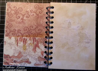
All the DP is from K&Co. The lined pages are white CS which I colored with Antique Linen Distress Stain. I just daubed it on, straight from the bottle using a circular motion. Since I don't have a journaling stamp, I drew the lines with a gold GellyRoll pen, then I lightly stamped a bunch of little nautical stamps into the corners using gold ink. The plain pages were done the same way, only I didn't draw lines on them. I stamped two different Maine lighthouses lightly in the centers of one side, and other nautical stamps in an all over pattern on the opposite sides from the lighthouses. I figured they could either write, or add photos to those pages.

There are some pocket pages and two flip out pages as well. I used my Cinch to bind it.


This is the cover. I used a JustRite stamp and cut it with the matching die. A title could be written in the center.


I may use the other large stamp from the same set for the page on the right. It also would have a large space in the center for writing in.


A flip out page, and a journaling page.


A journaling page and one for photographs.


A pocket page and a page for either journaling or writing.


A page for journaling or writing, and one for photographs. Sorry it's so terribly blurry.


A journaling page and one for photographs.


A journaling page and one for photographs.


A pocket page and a page for either journaling or writing.


A page for journaling or writing, and one for photographs.


A journaling page and one for photographs.


A journaling page and one for photographs.


A pocket page and a page for either journaling or writing.


A page for journaling or writing, and one for photographs.


A page for journaling or writing, and one for photographs.


A flip out page, and a journaling page.


A page for journaling or writing, and one for photographs.


A page for journaling or writing, and one for photographs.


The back cover.

I can't wait to decorate the box for it! See you all when I get back!

Thursday, April 18, 2013

Happy Birthday with Flowers Card


This card was made using some paper I got with a card making magazine a few months ago. After I attached the center part, I sort of wished I had added some ribbon going from side to side underneath it, but it was too late.

I used Spellbinders Decorative Labels One, and Labels One for the two bottom layers of the center, and two shades of lighter matching paper on them. (The bottom layer doesn't show enough so you can tell the paper is lighter than the background though).

The medallion and sentiment are both from JustRite, and are stamped with VersaMark, and embossed with gold EP. The bottom layer is colored with Copics, and both layers are shaded with Distress Antique Linen. The bottom layer is cut with a JustRite custom die, and the sentiment is cut with a Spellbinders Tag.

All the card layers are accented with a gold pen, and I used some gold outline stickers in the corners. The pearls are Liquid Pearls.

The image below is some interesting makeup things I found at Walmart. I thought I'd try them for shading. One side has a broad end, and the other is pointed for more detail. They were pretty inexpensive, and work fairly well. I've bought a lot of different shading things over the last few years, and while I like the Fantastix, they don't last very long, and are fairly expensive for something that wears out quickly. I like the Ranger nibs, but it's difficult to find them in my area, so these makeup things are kind of a compromise. I thought I'd add them to this post in case anyone else wants to try them out.


Wednesday, April 17, 2013

Yellow Daisy Card


I made this card a few days ago. It's much busier than I usually make my cards, but in person, it's quite pretty. I wanted to make a spring card, and I love this JustRite Background stamp, so I thought I'd try coloring it with non-holly colors, hoping it would look like leaves and yellow berries.

All the paper is Core'dinations Pearl, all coloring was done with Copics, and all shading was done with Brilliance inks. The green mat was actually made by running a Copic around the edges so it would match the leaves. All stamping was done with VersaMark and embossed with gold EP.

The center medallions are from JustRite, and cut with one of their custom dies, and with a Spellbinders oval. Everything was outlined with a gold pen and mounted dimensionally. The pearls are Liquid Pearls.

I didn't color the daisies like black eyed susans because they remind me of fall. Instead I colored them like some flowers my grandmother once had in a pot. I don't know what kind of flowers they were, but I think they were tender perennials. The centers were a deeper yellow than the petals.

WOYWW #202


I'm back for my second WOYWW. I had so much fun getting to know so many of you last week, and I hope I can get to even more blogs this week! For those who don't know what I'm talking about, hop on over to see Julia's Stamping Ground!

For those who thought I was neat last week, it's only because I have to pick up after every session. There is also so little room, that I pile everything up on the sofa and coffee table while I'm working.

To the left of my desk, you can see my Cinch V2 standing on the floor, and a little cardboard box to throw scraps into, as well as a Xyron, both sitting on top of boxes of supplies.

To the right of the desk is a rocking chair with boxes of stuff and my wax paper. See, I'm really not neat at all!

New things on the desk that weren't there last week are a cup of coffee, two cards I was working on, some Brilliance stamp pads, a Studio G white stamp pad, an Anna Griffin stencil, and a bunch of sponge daubers in an organizer box. Everything else was identified on last week's WOYWW.

Behind the desk, you can see some rolls of glittered gift wrap that I stick onto white CS when I want cheap glittered paper, as well as a couple of rolls of really pretty paper I bought years ago at a paper mill. There are more boxes of stuff back there.

If I'm not here next week, it's because we didn't get home soon enough to participate. My mother is selling a house out of state, and we have to go help her move this weekend.


Tuesday, April 16, 2013

White on White Stencils and Impressabilities Card


I wanted to play with my Anna Griffin stencils again today. I keep them in binders, along with a couple of Spellbinders Impressabilities I have, and decided to make the background with one of those.

I've only used one of the Impressabilities once. It was before the Grand Calibur came out, and I used it in my Big Kick. Unfortunately, it warped all out of shape when I tried to emboss with it. I tried this one in the Grand Calibur, and it worked well. Rather than using the letterpress technique, I stenciled Brilliance Platinum Planet on it to make it shimmer. (In case you haven't figured it out yet, I really like shimmery cards)! :-)

For the top medallion, I ran the stencil through the Grand Calibur and then stenciled it with the same ink.

The label at the bottom was made from two different stencils. This one was done on the light table. I used the sentiment from one stencil, and used another to make the bottom part of the border, then flipped it and did the top half. (It was a large border, so I only used parts of it).

All the embossed pieces were mounted onto Core'dinations Pearl CS, then mounted dimensionally onto the card. The accents are Liquid Pearls.

Monday, April 15, 2013

White on White Bouquet Stencil Card


I have quite a few brass stencils which I hardly ever use any more. I decided to use this very old Anna Griffin one to make a card.

I have made cards with this before by embossing on a light table, and it took forever to emboss all those tiny flowers, not to mention how much my hands ached, so this time I ran it through the Grand Calibur by layering the raspberry plate, the embossing pad, the CS, the stencil, and the white plate. The embossing isn't nearly as deep doing it this way, but this stencil has so much detail that I will use it much more often this way.

The other embossed layer was done with a Spellbinders M-Bossibility. Both embossed layers were done on plain white CS, because I knew I wanted to use my PearlEx Micro Pearl watercolor I made to add shine. The shine doesn't show up as much on pearl paper. Next, I used a Ranger Nib to highlight the embossed areas. The painted seeped a little under the stencil when doing the tiny flowers, even though I tried to keep it quite dry, but it isn't all that obvious in person.

Both embossed layers were mounted onto Core'dinations Pearl CS. The bottom layers were mounted dimensionally onto a pearl card, and the top layers were mounted dimensionally onto the bottom layers. The card was accented with a sheer white bow and Liquid Pearls.

Saturday, April 13, 2013

Bass Harbor Head Light Card


This is a very old stamp made in Maine of Bass Harbor Head Light in Bass Harbor, Maine.

I was looking at it this morning and wondering if it would look like snow if I embossed it in white, then colored it. Well, it didn't look like snow, but I kind of like it anyway.

I used a bunch of stamp pads and colored it with Ranger nibs after stamping it with VersaMark and white EP. There are a few touches of various markers and a bit of PenTouch gold as well. I shaded everything toward the edges and originally left them white, but didn't really like the look. Then I decided to use the VersaMark Aegean blue that I had used on the water to shade around the edges and in toward the rest of the colors.

Up here, we have a great deal of fog, and we get an interesting effect of very clear areas, up against the very thick fog when the sun begins burning it off. The fog is lighter, almost white where it is thin and the sun is shining on it, and gets very dark where it is still thick. That is the look I was going for when I shaded the edges.

The stamping was mounted onto pearlescent black/green CS. I colored another layer of white CS using the Aegean Blue and a sponge dauber. That layer was matted with antique gold, and mounted onto the card, then I mounted the stamp and green mat dimensionally onto it.

The compass was stamped, embossed and colored the same way, using ODBD's Sail On Set. It looks brighter in the photo than it does in person. This was mounted dimensionally on top of the lighthouse layer. I used one piece of dimensional tape on the top layer, and two layers of tape on the bottom layer to raise it up.

The seagulls were fussy cut from tiny seagulls in some K&Co paper and mounted dimensionally onto the card and white half pearls colored with a gold pen were added to the corners.

It's interesting, my blog friend Sasha called the effect on this card sea spray and made me look at it in a whole different way. Now as I look at it, the white embossin does kind of look like snow, and the way I shaded it looks like what we call sea smoke. It happens in the winter when the air temperature is very, very cold. The water evaporates and forms an interesting type of "sea smoke".

Friday, April 12, 2013

Gold and Pearl Bouquet


When I made my last gold and pearl card, the pearl flowers looked like mother of pearl, and it was really pretty, so I decided to try another card with gold and pearl flowers. I did these on a pale gold Core'dinations Pearl CS. The flowers don't look quite as much like pearl on this paper as they did the last time. It might be the light, it's really dark today. I don't have window sills, so I propped a plastic container up on the back of the couch and faced the card as much as I could toward the window, but it doesn't really show the shine.

The bouquet was stamped with an Anna Griffin stamp using VersaMark and gold EP, then painted with my Micro Pearl PearlEx paint. The layer behind is White Core'dinations Pearl which I also painted with the PearlEx to give it even more shimmer. Both of these layers were outined with a gold pen, and the flower was mounted dimensionally.

They were matted with more of the pale gold, some gold mirror card, and mounted onto a white pearl card.

I added some half pearls and a small gold bow as accents.

Thursday, April 11, 2013

Butterflies, Roses and Hearts


I've never used this Spellbinders edge with the hearts, so I thought it was about time I tried it.

I took a sheet of Core'dinations Pearl, and made 5.5 x 5.5 inch card, then die cut one edge, and used a Fantasix to stencil Brilliance Pink between the two die pieces.

I knew I wanted to cut the DP and mat to match the bottom, but was afraid if I cut them to size first, they wouldn't match, so I cut the CS wider than the card and used the die. Next, I laid them over the front in the position I wanted them and measured and cut them to fit, then cut a 5.25" square piece of pink for the inside.

The DP is from K&Co, and the pink is pearlescent CS from my stash. I wish I had bought more than one of each K&Co stack this paper came from when I first saw it, because I never found these stacks again. There were two matching stacks, and they had some lovely papers.

After applying the paper to my card using my Yes! Paste, I decided to stencil the hearts and dots with a deeper shade of pink Gellyroll pen. It made a pretty little design on the inside of the card, and made the hearts prettier from the outside. (You can't really tell that from the photograph).

The motif in the center is from JustRite, and was cut with one of their custom dies from Spellbinders. It was stamped with VersaMark, and embossed with gold EP. It was colored and shaded with a combination of the pink Brilliance ink, and two Gellyroll pens. Both layers were mounted dimensionally.

The butterflies are from two MS punches, and were punched from the same DP as the background, then I added gold accents, bent the wings up, and applied them with glossy accents.

Wednesday, April 10, 2013

Rose and Ribbon Card


Sorry if I haven't been around to visit you yet today, but we had to go to get the taxes done, and it's two hours over and two hours home. Plus, I joined WOYWW, (What's on your workdesk Wednesday), and it's great fun, but I didn't get as much visiting done as I wanted to on there either.

Anyway, I have quite a few cards I've never uploaded, and this is another one. The stamp is one I made, and it was colored with Copics. I used Spellbinders Romantic Rectangles to cut the paper.

For the yellow around the rose, I used a Ranger Nib and Brilliance Galaxy Gold to make the background. The next layer was colored with Memento Bamboo Leaves and a Fantastix. Both of those layers are dimensional, and I used an extra fine PenTouch to go around the inside of the die.

I wanted the lower layer to match, but be darker, so I used the same Bamboo Leaves first, then went over it with Memento Cottage Ivy. That layer was matted with some antique gold from my stash, and then mounted onto a white card.

I can never find nice mottled CS, and found I really like this way of making pretty backgrounds. Sometimes patterned paper is too much, but plain paper is too boring. With the ink and either daubers, Fantastix or nibs, you can make some really pretty paper in just the right colors!

To finish the card, I used Liquid Pearls and a gold bow.

WOYWW #201


This is the first time I have participated in WOYWW. My blog friend Regina reminded me to take a picture of my desk before I clean it up so I could post it. I always love seeing everyone's desks, so I thought I'd show mine!

This is the card I just finished. I work on a table, and have to clean up after every session, so I had to take the photo the night before.

The stamps I used on the card are on the left. You can also see one of my Xyrons in the photo. The cup has water in it so my paintbrush wouldn't dry out before I cleaned it. I used that to spread the Yes! Glue on my card.

You can also see two mesh desk organizers, one holds small paint brushes and my aqua painters, and the other holds blending stumps and Fantastix and things.

The wooden box is one of my treasures. It belonged to a great aunt, and is very old. She gave it to me when I was a child. That's where I put scissors and other small things that I use every time I stamp. Next comes some Krylon Spray, and a little box with a push pin and some scraps in it. When I use my Spellbinders, I use the pushpin to poke out the little bits into the box. I empty the box into the waste basket when I clean up.

Next comes my heat gun, which is barely visible in the photo, and a set of plastic drawers where I keep my most used stamp pads. In front of that is my Yes! paste and a glue runner which doesn't stick. There is also some Mod Podge, some regular tape that I use to stick my Spellbinders down with when I don't need to use removable tape, my wax paper, which is my most important tool when using delicate dies, some scissors, a roll of dimensional tape, and a little plastic container of watercolor I made from PearlEx.

There is also a glass jar of Ranger Nibs, Glossy accents, and a pencil.

To see what WOYWW is all about, and visit everyone's desks, go here to Julia's Stamping Ground.


Tuesday, April 9, 2013

Gold and Pearl Lattice Card


I was looking through my Dresden Paper this morning and decided to use this lattice background for a card. I used my new Yes! paste to attach the lattice and the gold borders around it. I like the paste very much, and think I will be using it a lot!

For stamps, I used four different ones from JustRite. They were stamped with VersaMark, and embossed with Gold EP. I cut and embossed them with matching Spellbinders Dies, then mounted them dimensionally, then decorated everything with Liquid Pearls.

After I added the pearls, the irises needed something, so I painted it with some Micro Pearl PearlEx paint I made. It was still wet when I photographed it, and the paint rippled the paper a bit while it was wet, but it's perfectly flat now.

It's one of those cards I really liked when I finished it.