Pazzles Bar

Get the Pazzles Inspiration, the most comprehensive electronic die cutter available, for as little as 99 dollars down.

Monday, April 30, 2012

Free Download Flower Border

This is a flower border between the front and the back of the self heating can label.

Free Download Apple Label Front

This is the front of the Self Heating Can Label.

Free Download Apple Label

The Self Heating Can Co. was the first to develop food which would heat in the can without fire. They developed food for people like loggers to take with them so they could have a hot meal. The cans were divided into three sections, with one section containing the food, one containing lime, and one containing water. When the sections between the water and the lime were punctured, a chemical reaction took place, and heat was generated.

This is one side of the label I have.

Sunday, April 29, 2012

Blogger Ramblings

Following Blogs, or putting Blogs you love in your sidebar. I'm not sure which is better, but I prefer them in my sidebar. Most of the blogs I visit every time they are updated, I found because they were in someone else's sidebar. Frequently I look down people's sidebars, and see a beautiful card, so I click on it, and if I like most of what I see on that blog, I add it to my sidebar with the updated picture option. When I visit my blog each day, I visit every blog that has an update to see what is new. I usually do that once in the morning, and once in the evening. For the new blogs I have added, as soon as I have free time, I travel around that person's blog, frequently I travel around by seeing something beautiful in the three photos that usually appear at the bottom of each post. If I really love a blog, I usually end up seeing every single page! I also especially love it when a blog has labels so I can see particular techniques, or projects made with a certain product.

One of the best things about the sidebar rather than following is that my visitors can easily see the blogs I like as well, and they may want to go visit them too. I just wish there was a way of showing photos for updates on Typepad blogs. Those blogs only show text.

Very soon I'm going to have to start categorizing my sidebar though, it's getting kind of long!

Saturday, April 28, 2012

A Different Kind of Folded Card


Note: when I first made this card, I didn't know where it originally came from. I saw the fold on a lot of card sites, but none gave directions or a link to the original. Today, Feb 8, 2013, I found the original card, as well as a diagram for it, so I want to give credit to the lady who, I think, did the original card. Her card and diagram are here: Bente Ă…rstad. I am so glad she shared her beautiful card and diagram with all of us!

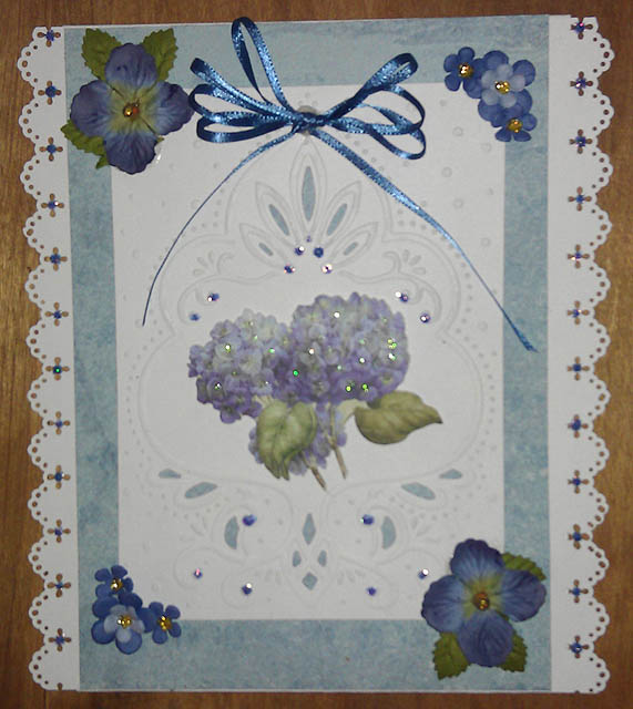
I keep seeing these cards on the internet, but I've never seen a tutorial for them. Also, I've never seen the actual front of these cards on any of the sites, so I decided to try to figure them out myself.

The top photo is the front of my card. I used Spellbinders Ironwork Accents and Motifs throughout the card. I'm not sure I like the way I outlined the front central motif though. I wanted it to remain lacy, but it didn't show up well enough without cutting two more motifs out of teal paper and off setting them. The roses are Prima. I just realized I forgot to put Liquid Pearls in the corner motifs where the white circles are. I added them, but it's after midnight now, so I'll wait to take more pictures.

Here is the card with the Liquid Pearls added to the corners. Sorry it's blurry, I took it really quickly my husband is outside waiting for me to come out so we can go off the island. I left the old one up because it's clearer. I really shouldn't update my blog in the middle of the night, or when we are about to go off. :-)

The next two photos are of the inside. I should have made the outside "jacket" of the card a bit wider so the folded points at the top and bottom were not quite so sharp, but it looks quite good in person despite that. The inside flowers are Prima and Recollections. The rhinestones are Queen & Co, and I used Liquid Pearls inside and on the front cover.

Free Download Scenic Can Label

This scene could also be used alone without the border. It might be nice decorated with Flower Soft!

More Wild Orchid Candy!

Cick the link to win some fantastic candy!

Friday, April 27, 2012

Free Download Barnyard Engraving

This is on a horse liniment label.

Free Download Rose Label

This is the back of a label from Edwin Parkhurst. I took the lettering out of the label so you could use it to add a sentiment.

Thursday, April 26, 2012

Filligree Flowers JustRite Friday Color Challenge 071 Perfect Pastels

I was having so much fun with these Star Collection stencils from Marianne Designs that I decided to make another card for JustRite Friday Color Challenge #071 - "Perfect Pastels".

This is my interpretation of one of the projects on the stencil. The motif in the center is JustRite's Applique Set. I tried to provide a link, but it's been discontinued, so I'll provide a link to their JustRite Original Retirement Sale instead so you won't miss any of the other wonderful sets which are being discontinued.

I colored the motif with Copic Markers and cut it out with Spellbinders dies. The flowers are Prima and Recollections, and the pearls are Queen & Co.

All the embossing was done on a light table, and the cutting was done with an Xacto knife. This card has multiple layers, but it doesn't show up in the photograph.

Free Download Small Carnation Label

This image was up for over a month. Be sure to check back for more free downloads.

This is the carnation between the pear and the other carnation on the Salesman sample label.

Free Download Carnation Label

This was up for over two weeks. Keep checking back for more free downloads.

Wednesday, April 25, 2012

Free Download Pear Label

This download was up for about two weeks. Check back for more free downloads.

This is part of one of my salesman samples of labels. They don't have company names on them. I thought this one had really interesting shapes, and nice white space to add your sentiments.

Please don't sell or give these away, or pin them to Pinterest. They will remain up for about a week after I post them, and are a gift for those who visit my blog.

Tuesday, April 24, 2012

Free Download Butterfly Refugee Labels Front

This download was on for over a week. Keep checking back for more free downloads.

Free Download Butterfly Refugee Beans Back

This was another of my free downloads. It was up for more than a week. Keep checking back for more free downloads.

Free Download Butterfly Label

This image was up for a week. Keep checking back for new downloads.

Here is another free download. You see the front of this label on a lot of free graphics sites, but I don't think I've ever seen the back. Since most people like butterflies, and I have the original label, I thought I'd put it on here for a week or so.

Click on the image to enlarge it before saving.

Monday, April 23, 2012

Elegant Roses

I made this card for the JustRite Friday Color Challenge #071 - "Perfect Pastels".

This card was made using Marianne Star Collection Stencils following a design by Petra van Dam. All of the embossing was done on a light table, and the cutting was done with an Xacto knife.

I just realized that the link to the page on Petra's site always goes to the first page. To see the card which inspired mine, click on Star Collection nr.08 in the dropdown on the left sidebar.

I again used JustRite's Elegant Frames Cling Set. It was stamped using Distress Peeled Paint, cut with Spellbinders Labels Ten, and applied using dimensional tape.

I used some very old Wright's trim for the lace on the edges, and Liquid Pearls throughout the design. The flowers are some my craft store packages, and two discontinued Prima ones. I outlined some of the stitching lines with a green sparkly Jelly Roll Pen.

I wish the embossing showed up better in the photo.

Friday, April 20, 2012

Wishing You Happiness

I made this card for JustRite Friday Color Challenge #071 - "Perfect Pastels".

This week we were supposed to use yellow, pink, peach and neutral. I decided to use this peach paper from DCWV Mariposa Stack, a yellow from Bazill, and the pink is from my stash. For the neutral, I used a generic white. I still can't afford to buy stamping supplies, so I hope you aren't tired of seeing me use the same stamps over and over!

For this card I used JustRite's Elegant Frames set. I cut the frame with JustRite's Nested Frames and Sentiments custom dies by Spellbinders. (I tried to link to it, but I can't find it on their site, so it must be out of stock). The frame and saying were stamped with Distress Peeled Paint, and the edges were accented with the same ink. I cut one of Spellbinders tags three in half and added it to the top and bottom of the label.

When I was deciding what to do with my Flower Soft the other day, I was thinking that quite a few of my JustRite stamps would look pretty decorated with it. I had several pots of Flower Soft with pink, peach and yellow in them, so I added some to look like flowers on the frame, then added Buttercup Liquid Pearls to the lacy parts at the top and bottom of the frame.

The Frame is mounted dimensionally over the yellow ribbon.

I then added Prima flowers to two of the corners, and Queen & Co pearls to the other corners and the ribbon and frame. The flowers aren't purple tinted in real life, they actually match the card much better than it looks in the photo.

Wednesday, April 18, 2012

Green Ribbon and Morning Glories Card


I had this really pretty green ribbon, and decided to make a card with it. It seemed to match this pretty K&Co paper really well, so I put it down the middle and added lace on the sides of it. The lace looks better in person. I used my ATG to glue it, and the flash from the phone's camera made it look really shiny. The pattern in the paper behind the green ribbon's sheer part doesn't show up as much in person either.

I mounted the DP onto gold mirror card and generic green CS on a white card. The stamp is from Anna Griffin. I used VersaMark and embossed it with a green tinsel embossing powder. It was cut out with Spellbinders Tags Three, and mounted onto green CS, then mounted onto the card with dimensional tape. Unfortunately I decided it needed something else, and I added green gel pen to the raised parts and outlined it with gold. They look better in real life too. In the photo it made the tag look messy. Anyway, I liked it better before.

Tuesday, April 17, 2012

My first Card With Flower Soft


I got my Flower Soft from Our Daily Bread Designs yesterday, and didn't have time to try it, so as soon as I could today, I made a card.

I knew I wanted to use my Heartfelt Creations die by Spellbinders to make a window with a flowery scene behind it. This design in one of my sheets of toile CS looked like it would work perfectly for it. I cut the scene out a little larger than the opening in the die cut and colored it lightly with colored pencils. Then I applied Flower Soft to every tree and plant in the scene. My Flower Soft is the Bouquet box, which has seven colors in it, and I was so excited to finally get it that I used all of them! :-) The set didn't have any green, so I decided I would make a flowering tree in honor of spring. The Flower Soft looks much more subtle in person than it does in the photograph.

I mounted the scene on some paper I bought by the sheet at an art supply store. This paper has a subtle pattern that reminds me of wallpaper around the window. The paper was mounted onto white CS using my Xyron before I adhered the scene to it.

I outlined the teardrops on the die cut with a Pen Touch pen, and mounted it over the scene with dimensional tape after cutting out the cross pieces in the window.

Everything is mounted on ordinary purple CS which is mounted on a white card. I added Queen & Co pearls to brighten up the purple a bit.

Sunday, April 15, 2012

Very Cool Bow

I haven't made one yet, so I don't have a photo, but there is a tutorial for a very interesting and different kind of bow here.

Let me know if you make one, it would be interesting to see them!

My narrow ribbon organization


A couple of weeks ago, I mentioned a tutorial here on storing narrower ribbon in empty Tic Tac containers.

Last week when we got off the island, I bought two four packs of Tic Tacs, and filled eight containers with ribbon.

Today, I got off the island again, and bought eight more. Here is a picture of what used to be sixteen spools of ribbon. They are all protected in the containers so they won't get dirty or unwind. They also take up very little space. Of course I need more containers, because I have a lot more ribbon, and a bunch of embellishment that would fit in those containers! The holly one near the center had a little bit too much ribbon, so I couldn't close the little snap top, but it's still protected and takes less space, so I don't mind.

Now we need to figure out a way to get Tic Tac to make some kind of candy and sell it in at least 1" wide containers so we can store wider ribbon!

Saturday, April 14, 2012

Pink Flowered Box


I have never made a box before but have seen some beautiful ones on the internet, so I decided to make my own.

I didn't follow any tutorial, I just made it, but I got the box top just a tiny bit too large for the Spellbinders Fleur De Lis die square, and it showed through some of the lace. I went over the edges of the box top with some pink distress stain so it would contrast with the lace.

The pink CS inside the Fleur De Lis is K&CO, and I cut it using the Spellbinders square die. The outside of the box uses the same CS.

The large flower in the center of the top is Prima, and the small roses are some my art supply store packages themselves. They are similar to the Prima ones I used to get there, but are about three times as expensive, and a little larger. They look like the same ones Wild Orchid has. Wild orchid has the same size I used to buy as well as some which are a little larger.

The dots around the lace are Liquid Pearls, and the white pearls on the sides are Queen & Co. I wish the photos were a little clearer. I also didn't photograph the box put together because the Liquid Pearls are still wet.

Wild Orchid is giving away Candy!

I love their flowers, and their prices are wonderful! To enter, click here

Friday, April 13, 2012

Blue Flowers and Lace


I haven't used this Marianne Designables folder for a long time, so I decided to make a card with it. The white CS behind the blue was supposed to be punched all around, but apparently MS punch around the page punches use different card dimensions for each punch. The instructions I used gave measurements of four, six, eight, and ten. I tried 6x8, but every time I punched, it never came out even on the page on either side. I need to see if I saved more instructions from other punches, since I went through five sheets of white cs trying to get it right.

Anyway, I decided to just punch the edges. Then, I had things I needed to do, so I was hurrying, and I used my new ATG and got the blue paper a bit off center. Well the ATG really sticks, so it's going to have to stay that way.

The flowers in the center are from K&CO, and the ones on the edges are Prima and Recollections. I used Stickles for accents and Offray ribbon for the bow. The bow is straight now, and I have to trim a little off the longer tail, but the glue was still wet when I took the picture, so I am going to wait until tomorrow to trim and shape it.

In real life, the blues match better, and the shading in the blue cs at the top of the card isn't as pronounced. There is other shading in that paper that doesn't show up in the photograph, so it really looks better. It's not my favorite card.

Thursday, April 12, 2012

Free Download raspberries

It's been a long time since I added a free download. I thought this one would make a nice tag for spring and summer cards. It's a fairly high resolution .png, and since it's a big file, it will only be up for one week.

I will be taking it down to conserve space on Thursday the 19th. To get it in the full size, click on the file before saving it.

This was actually up for two weeks. I took it down to make space.

Free Standing Pop Up Card

Today StampARTic had a tutorial for a free standing pop up card. I had seen these before but never made one, so I thought I'd try it.


This is the card opened. I had some K&Co diecuts that I thought would be really pretty standing up in the card. I chose a plain generic medium green CS to make the box, and mat the card with, and a creamy shade to mount on the back of the pop up for messages.

Then I chose a lighter green K&Co DP to make the panels with. There were borders in the DP, so I cut along those. Then I chose more K&Co diecuts and mounted them with dimensional tape.

The pearls at the top are sunflower by Queen & Co and the ones in the border at the bottom are Liquid Pearls.

The top is punched with a Martha Stewart border punch.


This is how the card looks folded and ready to go into an envelope. I don't think they are supposed to be quite as tall as that, but I don't mind it being tall. It was fun and easy to make!

Tuesday, April 10, 2012

My Second Never Ending Card

This one is neater, but it's not as pretty as the last one.

Tomorrow we are going to get our taxes done, UGH!! So I decided to try to get another card done tonight.

This time I used some K&Co Nautical paper and die cuts. Since I live on an island, I thought it might be fun to use this paper, even though seahorses don't live in the Labrador Current!

I have always disliked using double sided paper, because I can never decide which side to show, and which to hide. When I made my first card, I wanted to try using the paper so both sides would show rather than mounting it on another sheet. Well, now that I've figured out how these cards go together, I thought I'd try it with this one.

Before I started, I had it in my head that I would need to make sure neither side had a definite bottom and top, but by the time I got done choosing which paper to use, I had forgotten about that, so some sides are upside down. One of these times I'm going to get these cards right!

I tried to use paper that I didn't think would be too busy, but this one is busier than I would have liked it to be.


This is the front. I have mounted everything dimensionally on the front only, because I thought it would probably interfere with the folding. The only thing on the card that isn't K&CO is the anchor and saying. I used Just Rite Stamps for that. I stamped them with Black VersaMark and decided to emboss them with clear embossing powder. Now I remember why I never use the clear. I bought it way back in the old days, before stamping was popular. Before there were any big brands of stamps, just a girl in the mall demonstrating her own brand of stamps and primitive embossing powder. Well, the clear in those days didn't really give a lot of dimension, and made the ink paler than it really is. I guess I need to buy some new clear EP.


This is the second page, it's kind of busy for my taste.


I think the third page is too busy too.


I'm not wild about the back of the card either. I think I should have used something that covered the background more rather than the die cuts. Oh well, maybe I'll be happy with my next attempt! This page is the one where the upside down paper is the most obvious.

My First Never Ending Card

This is the first time I have made a never ending card. This one came out a bit messy, but I uploaded it because the K&Co paper and die cuts I used would work very well on this type of card. The next time I make one, I will probably make smaller margins around the DP.

The whole card is done with K&Co, except the sayings, which are Anna Griffin.


This is the front of the card.


This is the second section. I decorated it before I realized that the outer wings should have been decorated in the next step instead of this one.


This is the third section. If I had decorated it in the right order, there would have been two wider sections rather than four narrow panels, but it still looks okay.


This is the fourth section. It isn't laying very flat in the photo, I needed to crease it more. I also creased a lot of the card too much in places where I shouldn't have because I didn't open it right the first time.

I followed three different tutorials to make it. One didn't have dimensions for the six inch square I wanted, the next didn't tell me how to open the first panel. It was the third tutorial before I found out that when you open the first fold, the one behind it goes to the back of the card. When I did it wrong, I got creases where there shouldn't be any.

The next card will be easier now that I've done one, and hopefully much neater as well.

Anyway, I have lots of friends and family who love it when I give them my rejects!

Monday, April 9, 2012

I actually Won Something!


On April 2, I found out I won a gift certificate on the Our Daily Bread Designs Blog Hop.

Well, of course I had to buy some things as well as picking out what I won. (There isn't a requirement to buy, but it's impossible to look at all those beautiful things without buying more)! I chose two stamps, The Mighty Sea and Keep My Lamp Burning, finally got the Spellbinders Ironwork Motifs die I wanted, (Oooops, wrong Spellbinders die in the photo, I photographed the ironwork accents which I already had instead of the ironworks motifs which I got today), finally also got the pink Scotch ATG gun I've been wanting, and one of the box sets of Flower Soft which I have also been wanting.

Wow, everything came really fast! The Flower Soft - Bouquet Colour Selection Box I ordered was back ordered, so I still have something to look forward to in the mail when it comes in. I am really excited about the Flower Soft, so I can't wait!

So far, I have tried the ATG gun. (I only got my package an hour or so ago). I've tried everything available for sticking things down on my cards and albums, and so many things didn't stick well. I managed to find some of that red tape when I was in Rochester, NY, and that worked well, but it isn't available anywhere near me, so it wasn't really an option. I found myself only using it sparingly when I absolutely had to so I wouldn't run out, and I expect it's a lot more expensive than the ATG refills. Most of the other brands I had tried didn't stick well, and glue sticks aren't the best either.

The ATG really does stick, so you most definitely want to make sure you are applying whatever you are sticking straight the first time! It rolls off easily if you get it in the wrong place and haven't stuck your top piece on, it's only permanent when you add the top piece.

Yeah, it's a bit tricky threading it for the first time, but not too bad. I also read that you should release the trigger a little before stopping so the glue won't ball up at the end, and this seems to work.

I need to get used to the size, but I think I will pretty quickly, and I also need to remember to pull the trigger instead of trying to drag it across the paper without pulling the trigger!

Anyway, I think I'm going to love it! It's going to be so nice to finally have some tape that really works, especially on Albums. I can now save my red tape for when I'm sticking something really small and don't want to use the huge ATG gun.

Now I'm so excited for the Flower Soft. I've always wanted to try it, and almost tried some of my stuff they use for model trains in place of it, but there aren't enough colors, and that most of that stuff isn't as fine. (I use the model train stuff for doll house landcaping and flowers. I've made more dollhouses than anyone needs). I went to the ODBD website right after I got my package, and was so surprised that they have a special on Flower Soft this week. I'm going to have to use a lot of restraint not to order more.

Sunday, April 8, 2012

Pansies and Butterflies


This card isn't at all what I expected when I started. I was going to make another card with wired ribbon. I had some purple, and began going through all my purple paper, ribbons, and stuff I had printed, and by the time I had picked everything out, I never used the wired ribbon.

I know the pansy paper and the saying are Anna Griffin, the purple paper is pearlescent, but I can't remember where I got it, and the butterfly was on the internet, but I can't remember who's site it was on. I printed it years ago, and it's been sitting in an album. The gold is mirror card that our art store sells.

I used VersaMark around the tag and embossed it with Superfine Gold, and just layered everything. The butterfly and saying are mounted with dimensional tape.

The only purple ribbon I had was the really wide wired kind, and this very narrow Offray ribbon. I wrapped the ribbon three times around my fingers and tied the ends tightly around the middle to make a triple bow since the ribbon was so narrow.

Anyway, I thought it came out quite pretty for a card that was unplanned!

Golden Wedding Anniversary


I made this as a golden wedding Anniversary card, but since it only says Congratulations, it could be used for other events as well.

All the paper is gold mirror card and Core'dinations pearl, in shades of white, ivory, and gold. The fancy background behind the die cut is wired ribbon. (I pulled the wire out before I mounted it).

The ivory behind the ribbon was punched on both sides with a MS border punch. The stamping was done with JustRite's Elegant Frames set using VersaMark, and embossed with fine detail gold. I also embossed the same gold around the edges. The stamping was cut with Spellbinders Labels Four, and a JustRite custom die made by Spellbinders.

The motif behind the stamping is Spellbinder's Fleur dis Lis Shapability Pendant, with motifs from the same set cut in darker gold at the top and bottom. I accented parts of the darker gold fleur dis lis with gold stickles.

I want to wish everyone a very Happy Easter!

Thursday, April 5, 2012

Pink and Gold Book Card


I wish the colors came out better in this photograph, the embosed saying is really gold, but it looks pink in the photograph.

I was going through my Spellbinders dies, and realized that I've never used this one. When I bought it, I thought it would make a beautiful book card, but when I got it home, I realized how small it really is. I would love to see this die in the grand size so you could actually have room to put something on each page!

All of the paper is Core'dinations Pearl, one white, and the other pink, plus gold mirror card. The little swirly stickers are from my stash, and the tiny gold flowers are Dresden paper.

The saying was stamped using VersaMark with the JustRite Elegant Frames set, and embossed with fine detail gold. I added Queen & Co. pearls, and Liquid Pearls for the flower centers in the stickers. The bow is tied using Offray ribbon.

Tuesday, April 3, 2012

Very nice idea for ribbon storage

I just saw a very nice idea for storing narrower ribbon. It uses Tic Tac Containers!
I had to share it with you all.

You can see the tutorial here.

I hope you find it helpful!

Flowers and Lace Album

I finished the album I showed parts of yesterday.

This album is 5"x7", and is made to hold six 4x6 photos. It would work for either a girl or woman, or for a wedding.


This is the cover. I used Spellbinders Fancy Tags Three shaded with VersaMagic Sky Blue, and accented with Liquid Pearls for the label.


The album is like a book, and when you open it, you see these two spots for photographs. The photos slide easily under the lace borders, and that is what holds them in place.


When you open the two photo pages outward, there are spaces for four more photos.

The DP is Colorbok, and all flowers are Recollections. The greenery is the MS Branch Punch, and the lace is an MS border punch. I applied the Offray ribbon after running it through my X shaped Xyron. I used Liquid Pearls for accents and in the flower centers.

I have listed this item in my Etsy Shop.

Monday, April 2, 2012

I'm working on a different kind of album

This is what I've finished so far. Hopefully tomorrow I will be able to get the covers done and upload the rest. I'll also try to take better photos. Right now, the Liquid Pearls are drying. Update: The completed album is here.

This album is 5"x7", and is made to hold six 4x6 photos. It would work for either a girl or woman, or for a wedding.


The album is like a book, and when you open it, you see these two spots for photographs. The photos slide easily under the lace borders, and that is what holds them in place.


When you open the two photo pages outward, there are spaces for four more photos.

The DP is Colorbok, and all flowers are Recollections. The greenery is the MS Branch Punch, and the lace is an MS border punch. I applied the Offray ribbon after running it through my X shaped Xyron. I used Liquid Pearls for accents and in the flower centers.

Hopefully you will be able see the rest tomorrow. Update: The completed album is here.