Pazzles Bar

Get the Pazzles Inspiration, the most comprehensive electronic die cutter available, for as little as 99 dollars down.

Thursday, January 31, 2013

Pink Friends Card JRC_089


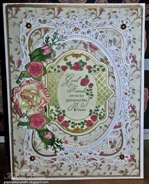
Our power was off for most of today, so I played around with making some cards. I have seen quite a few cards using the centers of the Spellbinders Fleur De Lis Pendants to make a lacy overlay, so I decided to try one. I wasn't sure how they were going to fit on the card, so I scored the pink CS 1/4" in on all four edges, then I scored it in the center diagonally both ways. After that, I scored every 3/4 of an inch diagonally. This gives an embossed lattice background under the overlays, and let me see whether or not I was getting all nine medallions straight and centered. I mounted that layer onto a 6x6 card and went around the pink layer with a gold Krylon pen.

Next, I tried various dies on it, and decided I liked this one from Spellbinders Marvelous Squares. I seem to always use my Tsukineko ink pads because I like them so well, but that means I seldom use my other ones. I decided to use Distress Spun Sugar on this card for a change, and shaded the die cut with that. Then I tried a bunch of stamps, and I really liked another of my Favorite JustRite Stamps for the medallion in the center.

This one is Vintage Rose Medallions, and is another of my favorites because of the beautiful frames and many sentiments which mix and match with this and so many of the other JustRite Stamps. It also has matching JustRite custom dies, making it really easy to use! I cut this one with JustRite's Custom Nested Medallion Labels Dies. Since this is another favorite, I'm entering it into the JustRite Friday Challenge #089 - Anything Goes.

I first stamped it with Spun Sugar, but it was too light, so I stamped it a second time with Brilliance Rocket Red Gold. I wanted to use clear embossing powder over it, but of course heat guns don't work without power. :-) It looks pretty anyway. The medallion is surrounded by the little corner motifs from the Marvelous Squares set.

To finish, I accented everything with pink and white Liquid Pearls. The ones on the left don't light up, but I couldn't tell the sun made them look like they were lit up until the power came on and I could look at them on the computer. By that time, the sun was gone.

It's pink Jill!


Wednesday, January 30, 2013

Noor! and Creatables Birthday Card


We finally got some sun this afternoon, so I took a better photo of this one.


I had forgotten I had bought these flowers at a closeout store until yesterday, so I decided to make a card using them. For paper, I used a DP I got while I was away last month, some Core'dinations Pearl, and gold mirror card.

The corner pieces and the bottom layer are from Noor! Designs. The round scalloped layer is a Marianne Creatable, and the DP circle over it is Spellbinders, as is the tag on top.

All the shading and stamping were done with Memento Bamboo Leaves, and the sentiment was embossed with clear EP. The sentiment is from Becca's Kit Club, and was designed by Becca Feeken. The stamps were made by JustRite.

The layers were mounted using a combination of dimensional tape and glue dots.

When I finished the card and held the flowers against it, they looked too bright for the card, so I toned them down by spraying them with a mist from Lindy's Stamp Gang. The mist is brown with subtle green mica sparkles. The foliage is from the MS Branch Punch, and the pearls are Liquid Pearls.

Tuesday, January 29, 2013

Pink Bird Card ODBDSLC140


I made this card for Our Daily Bread Designs Challenge ODBDSLC140. The challenge this week was to use White, Pink and Red in our cards.

It's been so cold here that I'm thinking spring, so I used the ODBD set He Watches Me, and cut it with the matching Sparrow Die. The bird is supposed to be a sparrow, but to make it fit the challenge, I turned it into a Crossbill. I don't think I got the white wing bars quite right, and the beak is a little weird, it was kind of hard to make it look crossed, but it does sort of look like one.

The bird is stamped onto Core'dinations pearl using VersaFine, and embossed with clear EP. He is colored with pink, gold and brown Copics. The thistle is colored with green and deep red Copics.

The paper is all from K&Co, and Core'dinations pearl. I used Spellbinders Floral Ovals to die cut with, and layered them dimensionally. All the DP is outlined with a Krylon pen.

The roses are some off white ones I bought at Michaels and shaded with VersaMagic Perfect Plumaria, and the deep red ones were from some bouquets I bought in a close out store. The foliage is from the MS Branch Punch. I finished by adding a few white pearls from my stash.

Monday, January 28, 2013

Layered Card with Spellbinders and Noor! Dies


Sorry about this terrible photograph, it's so dark today natural light didn't work. If it's lighter tomorrow, I'll try to upload a better photo.


The sun is out this morning, so I took another photograph. This one shows the layers a little better.

I was playing around with some of the layers I didn't use yesterday, and decided to try a layered card with a patterned background paper. I bought this pretty paper at Hobby Lobby in December, and cut and embossed new shapes so I could use Memento New Sprout to shade them, rather than the gold I used yesterday.

This card uses Spellbinders Fleur De Lis Pendants, Marvelous Squares, and I can't remember the name of the other square one, and one of the Persian ones in the center. The corners are from Noor!.

The larger Fleur De Lis pendant was cut into quarters, spread out, and mounted diagonally to let the corners show up more behind the layer above it. Almost every layer is dimensional. The pearls are Liquid Pearls.


Sunday, January 27, 2013

Spellbinders and Creatables Layers Card


Yesterday I cut a bunch of Spellbinders and Creatables and shaded them with gold ink. I played with them, layering them in different ways, and with different combinations of the ones I had cut, and this is what I decided on.

The bottom one is a Marianne Creatable, the next one is from Spellbinders Marvelous Squares, and the top ones are all from Spellbinders Persian Motifs or Accents. Since I mounted all of my dies onto magnetic sheets, I'm not always sure exactly which set they come from, but I love being able to see them all at once!

All of the paper is Core'dinations Pearl except one layer, which is gold mirror card. The different shades are all made by sponging on the same gold ink. The darker shade of the gold is done by applying it more heavily with a Fantastix, and one layer is outlined with a Krylon pen. Almost every layer is dimensional.

I added Platinum Liquid Pearls for accents, and I'm hoping they look like pearls when they dry because these Liquid Pearls were very liquid for some reason. Usually Liquid Pearls are stiffer, but these are sort of flattening out on me. I was planning on adding very small dots of them to each little shape around the edges of the bottom die as well, but I thought I'd wait and see if they were going to hold their shape first.

Saturday, January 26, 2013

Friends and Roses Card JRFC #089


This week's Challenge at JustRite is Anything goes. We are to use one of our favorite JustRite stamps. I love their stamps, so it's really difficult to choose a favorite.

Most of JustRites stamps are so easy to mix and match to use parts and sayings from different stamp sets with each other. I don't know whether this is my favorite or not, because I have so many favorites, but I really love the flowered and lace stamps by designer Amy Tedder, so I chose this one.

This set, Spring Rose Medallions, has a lot of nice sentiments, it has matching custom dies, it works well with some others of my favorites, the Lace Background stamp and the Lace Medallions set, and it's clean and open. I don't really like the ones with too much going on, it makes it difficult to see the beautiful parts. This set leaves white space inside the medallions so you can add as little or as much as you want. (Wow, did I just say that when I'm showing this card which has so much going on)???!!! Normally I don't have this much going on in my cards, because I prefer showcasing certain elements in my card rather than having a lot of competing stuff.

Anyway, I cut the medallion using JustRite's Custom Nested Oval Medallion Labels Dies by Spellbinders. It was stamped with VersaMark and embossed with gold EP. I colored it with Copics, shaded it with Brilliance pink, and outlined with my Krylon pen.

The oval layer uses Spellbinders Floral Ovals. This was also shaded with the Brilliance pink, and outlined with some pink pearls from my stash. The inside of the oval was cut with a smaller Spellbinders oval using DP from K&Co, and outlined with the Krylon pen.

The rectangular layer is cut with Spellbinders Decorative Labels Eight and shaded with the same Brilliance ink. The inside was cut with Labels Eight from the DP and also outlined with the Krylon pen.

All of these layers were mounted dimensionally on top of a DP background which was also outlined with the Krylon pen.

The card was made from Core'dinations Pearl CS, and the die cuts were cut from the same paper.

The card was decorated with roses and rose buds from my stash, pink half pearls, and foliage from the MS branch punch.

Friday, January 25, 2013

Mighty Sea Card Pearl Ex and Twinkling H2Os


I used one of my scenes from yesterday to make this card.

I wanted to keep it simple because there is so much shine, and without embellishments, it could also be used for a masculine card.

The scene and card background are matted with silver mirror card. The background is some shimmery textured card from my stash.

I put another photo below showing how it sparkles with the sun on it. The embossing powder is silver tinsel I've had for years, and the stamp is from Our Daily Bread Designs.

Below these is another experiment with Pearl Ex.


This experiment was done on dark green CS.

The sky actually blends better in person. Some of the flowers are done with duo colors, so they change color with the light.

I hope this weekend I can get some more of those jars I mix Pearl Ex in. It would be fun to mix duo colors so the scene would change from spring to fall as you move the card!

Thursday, January 24, 2013

More experiments with Pearl Ex and Twinkling H2Os


I've never done much with water colors before, and I still need practice, so these aren't great. I decided to try playing with my paints again today to see if I could make a moonlight scene.

I decided to try the Mighty Sea set from Our Daily Bread Designs for this one. For both experiments I used the same dark blue CS.

For the one I did first, I stamped it with VersaMark and embossed it with silver EP. When I embossed it, I realized that there was too much embossing, and very little room for coloring for what I wanted to do. I decided to try it anyway and see if I could make a "happy mistake" instead of trashing it.

It actually looked kind of interesting when I finished it, and I will probably try to do something with it. I painted grass into some of the places where it was supposed to be sand and rock to give it more color.

For the second one, I stamped it with black VersaFine. Please ignore my funny looking birds. :-D I told you I'm not good with water colors!

Anyway, that one could have come out worse, and it was fun experimenting! I'll probably use that one for something too, since the shimmer makes them quite interesting in person.

Wednesday, January 23, 2013

Pearl Ex and Twinkling H2Os Painted Card


Today I made paint out of my Pearl Ex and gum arabic. The Liquid gum arabic is really expensive, so I was too cheap to buy it. I finally got the powdered stuff from Jacquard last week when I sent for all that stuff.

On Sunday, when we went off the island, I got a bunch of little clear jars made by Leow Cornell, and during the week I kept mixing a few colors a day until I filled all the jars. I have 38 colors of Pearl Ex, so it took a while. (Now I want all the colors)! I also want more of the little jars, because I want to make some more Duo colors with what I have. It's really fun!

I made small amounts of each color in each jar. They are watercolors, so you let them dry and use them just as you do with twinkling H2Os. If you want to try it, it's one part gum arabic powder to 4 parts Pearl Ex, and just add enough water, (I used a medicine dropper), to mix to a creamy consistency.

I used a Duo Red Blue for the roses, and took a bunch of photographs trying to show how the color changes with the light. The roses are shaded with Twinkling Black Cherry.

The colors I used are a combination of my Pearl Ex paint and Twinkling H2Os. I used Pearl Ex Spring Green for the leaves and shaded them with Twinkling Sweet Alfalfa. There is a dew drop on the leaf, which I used Twinkling Pearl Green on, but on the dark color, it turned very green when dry. I forgot to do it before I took the photographs, but I'm going to put Glossy Accents on it.

The baby's breath is Pearl Ex Micro Pearl.

I stamped an old Stampendous Rose onto wine colored paper with VersaMark, and embossed it with gold before painting.

Please excuse so many bad bad photos. Some were taken in the sunlight, and some were taken after dark. Some with, and some without flash. I was trying to capture how the color changes with the light. The background looks different colors as well, but that doesn't change. It's real color is a deep wine. The roses change from blue to violet to pink, and the leaves from a bluer green to a yellower one.

All the painting is very shimmery.


Tuesday, January 22, 2013

Card Made from Marvelous Squares


This is a much better photo than the one I uploaded last night.


Earlier today, I made a post where I was playing with the Spellbinders Marvelous Squares die set, and gave examples of different ways to cut them. I was playing around with all those die cuts, and came up with this card.

The paper used is Core'dinations Pearl, Teal CS, Purple CS, and Gold Mirror Card. The colors are a bit off because, as usual, I photographed it after it was dark.

Most of the die cuts had Brilliance Sky Blue ink sponged on them while they were still in the dies. The purple in the center is the purple CS, which you can see peeking out from behind the cut outs in the pieces. I need to try photographing this again tomorrow when it is light, and uploading another photo. I did this one on an angle to show off some of the dimension. Some pieces are flat against the background, and some are mounted dimensionally.

The pearls are all white half pearls. I colored some of them with a teal Sharpie.

I'm not sure whether or not I really like these colors together, but I was trying to use something different.

Playing with Spellbinders Marvelous Squares


The Marvelous Squares have a lot of different ways of using them together, and it's difficult to picture what some of them will look like when cut and embossed.

Today, I cut a bunch of them out, mixing and matching to see how they would look when some of them were cut together. I decided to photograph them for future reference, and also decided to put them on my blog in case anyone else found it useful.

I put the four separate little corner pieces into the blank diagonal sections of some of the cuts to show how they can be used to decorate the blank spaces.

Monday, January 21, 2013

Roses Friendship Card


I wanted to use my oval Spellbinders again, so I paired them up with my regular ovals, Decorative Labels Eight, and Labels Eight to make this card. The DP is some old paper by Anna Griffin.

When I outlined the DP, all my gold pens were pretty much out of ink, and it didn't come out very well, then I remembered I had a new one with my Christmas stuff, but unfortunately I didn't have enough of the DP to redo it, so I left it that way. I used the new one on the rest of the pieces, and they came out better.

All the die cut layers are mounted dimensionally. The center medallion is stamped with Memento Bamboo Leaves, and is a JustRite stamp. It is cut out with one of JustRite's Custom Dies by Spellbinders, colored with Copics, and accented with my new gold pen.

The large rose is one of the roses I bought at Michaels in the bridal section. I used Brilliance Rocket Red Gold to accent the petals. The small roses and rose buds are some I've had for a year or so. The foliage at the end of the sprays is from the MS branch punch.

The pearls are gold half pearls and Liquid Pearls.

Sunday, January 20, 2013

My Second Trifold inside a Gatefold Card


I really need to stop photographing my cards at night. It's so difficult to get them to look nice with the flash.

When looking at my recent cards the other day, I realized just how much I like opening my last card like this. It's sort of like opening a present, with the gift of another card inside. This paper is so glossy and heavy, and so elegant, so I decided to make another one.

This time for the front, I used a teal colored sheet with gold foil designs. It reminds me of a fancy garden gate, or a fancy door. I used the same Spellbinders die as I did on the last card, to cut the gate "handles" out of gold mirror card, and added teal pearls to the die cut, and gold ones to the corners.


This is the card open.


This is the first part of the trifold open.


This is the whole card open. The round tag was on another sheet from the same paper pack. I fussy cut around it and added it for a writing space.

We're going off the island today, so I'll visit you all tonight!

Saturday, January 19, 2013

Marvelous Squares Card with Rhinestones Added


After doing my Decorative Labels One card, I decided to add rhinestones to the Marvelous squares card too. I like it a lot better now. It was also daylight when I photographed this one, and while it doesn't show the sheen of the paper, it does show the dimension better.

The photo from the other day is below, so you can see the difference.


Fancy Wheel Card


The stamp on this card is an old Anna Griffin stamp I've never used. I decided to color it with Copics, and design a card around it.

All the stamping was done with Memento Cottage Ivy, The Happy Birthday is from JustRite, the white paper is Core'dinations Pearl, the patterned DP is some hand made paper from an art store which I applied to white CS using my Xyron, the gold is mirror card, and the green and plain purple are from my stash.

I used a variety of Spellbinders and layered everything dimensionally. (Sorry about not naming the Spellbinders. Right now my Spellbinders are all mounted onto magnetic sheets, and they aren't labeled). Some of the layers were outlined with a gold Krylon pen, and some were shaded with a purple Brilliance ink pad.

Some of the pearls are gold half pearls, and some are Liquid Pearls.

After finishing the card, the layers had so much dimension that the stamped wheel looked kind of flat, so I used Glossy Accents to go over parts of the stamping to give it dimension too.

The "ribbon" on the outside edge of the stamping is actually the same yellow as the flower in the middle, it's not green, but the glossy Accents must be reflecting the green in the stamping in photo, making it look green.

Friday, January 18, 2013

Decorative Labels One Card


I was excited to try my new Decorative Labels One die set from Spellbinders, so, like yesterday, I cut and embossed the whole set.

All paper for this card is Core'dinations Pearl white. All shading is either Brilliance Galaxy Gold, or Memento Bamboo Leaves.

The dies used are Spellbinders Labels One, Grand Labels One, Decorative Labels One, Shapabilities Fleur De Lis Pendants, and one of the Persian accents or motifs for the center.

I cut and layered all the Decorative Labels, shading them with Galaxy Gold, then decided to use the Labels One and Grand Labels one for the card and bottom layers.

After cutting and shading all the rest of the Labels One layers, I mounted them dimensionally.

The corners needed something for decoration, so I cut a bunch of the Fleur De Lis Pendants, shaded them with the Bamboo Leaves, and cut the corners off, using one corner of the die in each corner of the card. Next, I added the Persian die cut to the center, and added a bunch of rhinestones.

After seeing all the pretty sparkle on this card, I may try adding a few rhinestones to some of the die cuts in yesterday's card.

Thursday, January 17, 2013

Marvelous Squares Card


I didn't have to chase two of the last packages around today. They got held up for a few days where they were sorted, but even though they were marked as undeliverable, they did send them to our PO and I could pick them up there.

These two contained my Spellbinders Marvelous Squares, Decorative Labels One, and Fancy Framed Tags One. I've been wanting Marvelous Squares since it came out, but like the oval ones, every time I tried to buy them, they've been out of stock. Now, I finally have them!

With some elaborate dies like the Marvelous Squares, I like to try cutting them all out and layering them just to see what they look like together. There are a number of ways of cutting this set of dies, but for the first time, I just cut each one individually, not using the negative pieces, and shaded and layered them.

For this card, I used my favorite Core'dinations pearl paper. I love the sheen and weight of it.

All the diecuts and the card were done with white pearl, and the embossed layer was cut from pink pearl. The pink layer was embossed with the Cuttlebug Dotted Swiss EF, and outlined with a Krylon pen.

The diecut layers were all shaded with Brilliance Pink, except the four fancy little corner pieces, which I left white.

Every layer, including the dotted swiss layer were mounted dimensionally, so this card is very dimensional. The only things which were mounted flat were the four little fancy corners.

With all this dimension and texture, it looks better with no other embellishments.

Wednesday, January 16, 2013

Tudor Cottage Card


This is a very old Comotion stamp I've had for years. (I didn't spell Comotion wrong, it only has one "m" in the name). I love coloring with Copics on Core'dinations Pearl paper, and everyone who sees it in person loves the iridescence of it, especially when combined with gold embossing. I did this card the same way using versamark, gold EP and Copics.

The image looked really pretty when I finished it, but I don't really like the way I did the card. If you're like me, you know how it is to try one thing after another for hours, and never come up with anything you really like.

Anyway, rather than just putting the image away for later like I usually do when I can't figure out anything I like, I made the card using a very dark green pearlescent card for the matting, and a patterned paper from my stash.

The only thing that looked half way okay for embellishments were a few pearls. It's not ugly, but it isn't my favorite either.


Tuesday, January 15, 2013

Seashell Fancy Fold Card


I made another card in almost the same style as yesterday's card. This time I used a seashell paper and dimensional die cuts from K&Co. I also added three staggered tiles on the front. I didn't cut holes behind them on this card like I did on yesterday's card.


All patterned paper is K&Co and the antique gold is from my stash. The patterned paper is outlined with a Krylon pen. I used Antique Linen on a Fantastix blending thing to shade around the tiles, and added some gold pearls.

For those who read yesterday's post about the mail problems, I managed to get three of my packages today. When I checked the tracking this morning, one was on it's way back. I called the last scan location, and they let me drive all the way there to pick the package up. Not exactly convenient when you live on an island, but I wanted my gum arabic, Stamp-ama-jig, and refill for my ATG, so I went after it. This was the package that was supposed to come FEDEX. It had lots of strange tracking information on it.

The other two packages were the ones I called about last night, which were about to be sent back. One was my Lindy's Stamp Gang Try Me set of pearl sprays and powders. It looks yummy! The third package was my Score Tape. It was very expensive because they charged $8.00 shipping, plus the cost of the tape. Unfortunately, I don't know a lot about shopping on Amazon, and didn't know the shipping was going to be so high on one inexpensive item.

Now I'm waiting for the other three packages.

I did go to the Amazon Forums last night about this problem, and was surprised at how many other have the same problem, and their orders are sent back too. If anyone else reads this and has the same problem with not being able to enter both your PO Box, and your address, one of the suggestions over there is to try to fool the computers by using zeros instead of the letter o, and space it differently, such as P 0 B0X or P0B0X using zeros. Not sure if this will work though, my spelling checker just saw that combination as PO Box.

Anyway, so far I managed to get four out of seven. I hope I get the ones with the Spellbinders!


Monday, January 14, 2013

Blue Butterflies Fancy Fold Card


I made this card much more difficult than it had to be. I started out by cutting half of the inside of the gatefolds where the square tiles are so they would swing out when the card was opened. It was a bit of work to make sure they would line up exactly with each other. As it turns out, it didn't add anything to the card, and I would have been better off just to make a gatefold with flaps and add the tiles to half of them.

The top photo shows the card closed.


This photo shows it open. I really prefer the butterfly on the right, but the set it was in only contained one. Since I knew I couldn't put much dimension inside the card because I didn't make allowances for it to fold flat, I put that butterfly, which will fold flat inside, and the other one, which is dimensional on the outside.


This shows the card laid out flat.

The DP is from K&Co, and is outlined with my Krylon pen. The butterflies are also K&Co.

The light blue sparkly paper is from my stash, and is also outlined with the Krylon pen.

The frames on the tiles are cut with a Spellbinders Die, and I cut the centers out with a smaller square Spellbinders. I used Core'dinations Pearl for them.

The larger flowers are more of the ones I got at Michaels. They were off white, and I dabbed them with Brilliance Sky Blue, then added light blue Stickles to them. The small ones are from my stash, and I added Stickles to those as well.

There are Stickles in each empty corner of the card and on the die cuts as well. They will probably be lighter than this, but they were all still wet when I took the photograph.

Sending for Packages and Delivery Methods

Now I'm venting.

An update: I just checked again. As of now, two of my orders are being returned for incorrect address.
Another update. I made a bunch of irate calls and found out where two of the packages are. They are going to try to send them back to me. They hadn't left that particular PO yet. They are suggesting trying some kind of a code like POB instead of PO Box. Now there are only four more packages to worry about.

I still have about had it with the Post Office.

When I won the Amazon gift certificates a couple of weeks ago, I was really excited. Now, I'm wondering if I'm going to get anything except the Copic Maker refill.

I think I'm mostly writing this in the hopes that companies realize that there are huge problems with the post office in some rural areas. We NEED to have a choice of delivery methods if we can't use our PO Box address.

Here, because of the financial difficulties the PO is in, our mail isn't sorted on the island any more. We are lucky to have a PO at all. It is sorted somewhere else, in a place where they have no idea who we are, so if you don't let us put a correct address on our packages, they send them back. If you require a street address, then send it UPS. (Don't send it Fedex either, because that also goes to the PO, and gets sent back as no such address).

My purchases were sent in seven separate packages. They all said they couldn't ship to my correct address, they had to have a street address. Up until recently, a street address meant it was either coming UPS or FEDEX to your door. FEDEX never had good delivery here, because they only came when they had a lot of packages, so you always had to wait, sometimes for as long as two weeks. (I don't blame the drivers, they got paid nothing for coming all the way out here). Now they just bring it to the PO that sorts our packages, and then it disappears into a black hole.

My Copic refill came UPS. It got here in only two days, and came ground from a long ways away.

Another package which came FEDEX disappeared on Friday. It said it was scanned here, at the post office, and was out for delivery, but it never arrived at the Post Office here.

Two more packages shipped through the mail said the same thing on Saturday. They never arrived at our PO either.

All three of those packages still say they are delivered.

Two packages said they entered the system, but who knows where they are, because their status hasn't been updated in a week.

One package I can't get any info on at all. No tracking number or info, it just has said shipped for a week now.

I can't order from Scrapbook.com because my last package floated around in eternity for over three weeks after they sent it out, and it almost got sent back. The reason it floated around for so long was because it had an incorrect address because no combination I tried when I placed the order would let me specify a correct address and delivery method.

Two packages we sent for before Christmas as Christmas gifts from other companies were sent back and we are still trying to get our money.

If you have a company, and you require a street address, please let us know on your shipping information page if you only ship through the postal service. It will save those of us in rural areas a lot of headaches.

Sunday, January 13, 2013

Trifold Inside a Gatefold Card


I decided to use some more of my Royal Garden paper from DCWV. (It's pink Jill)!

This paper has sort of an oriental look, and sort of persian look to it, and I love gatefold cards for both of those styles. I also thought that since this paper is very fancy, I would add a surprise element, so I put a trifold card inside.

This paper came with a sheet that could be cut into borders, and I thought the pretty pink and white border on the front would make great doors, so I used the pink and white theme, matted with gold all through the card.

For the front, I used a Spellbinders die to make the fancy door handle. I was so worried about getting it straight on the doors that I messed up the height, so it is a bit higher than it should be, but since the card was finished except for the door handle, and it was stuck down in good shape, it will have to stay that way. I added an identical die cut to the other side to add strength and make it look more finished when open.

I finished the front by adding a ton of pearls. I also made the front doors overlapping because it stays closed that way, and I also only wanted to use one solid die cut for the handle.


This is what you see when you open the front doors.


And this is the first part of the inside trifold open once.


Here it is fully open.

Saturday, January 12, 2013

Pearly Peacock Card


All the pearls on this card are white, but it is a very reflective card. Some look blue, some look green, some look gold, and some barely show up at all. It's quite dark here, so it was really difficult to photograph this.

I love peacocks, and took tons of photos of them when I was at Magnolia Plantation and Gardens in South Carolina last winter, so when my mother saw this Royal Garden CS by DCWV, she bought it for me for Christmas.

I was looking through the paper stack, and when I saw this peacock, it reminded me of a Zva Creative Pearl flourish I had been hording. The flourish was a gift when I sent an order to At Joan's Gardens. Joan is wonderful, and if you are looking to buy some of the more unusual dies, as well as lots of other things, check her site first. She's very fast, and you get to talk to a live person when ordering.

This is a 7" card, so it's really large. The peacock CS is matted with teal CS, blue Core'dinations CS, and gold mirror card, and mounted onto a Core'dinations pearl card. All the Spellbinders cuts were done with more of the pearl and shaded with Brilliance Sky Blue and a gold Krylon pen.

The stamp is from JustRite, stamped with VersaMark, and embossed with gold EP. Besides the flourish, I also added a ton of tiny flat backed pearls.

Friday, January 11, 2013

PSX Grist Mill Card


I wanted to use another of my old PSX stamps to make a card. Since this stamp would work for a man, I decided to use a minimum of embellishments. I think this would work for either a man or a woman, and can be used for many different reasons.

It is stamped with Distress Peeled Paint, and is simply layered and matted with two different greens and an antique looking metallic gold from my stash.

The only embellishments are a few pearls which were white, but I colored them with my Krylon pen.

The first package from Amazon came really quickly, it only took two days! I got it today. It only had my colorless blender refiller, but I was really missing it since my Copic ran out of ink.

I wasn't sure how to refill, and my injector thing hasn't come yet, so I went over to the Copic site and found directions. It was really easy! For the Sketch markers, all you have to do is drip 15 or 20 drops onto the broad end of the marker. I didn't have to remove the nib at all, and it worked!

Thursday, January 10, 2013

Roses, Roses


Over the holidays I got this Spellbinders die, and Brilliance Rocket Red Gold. Of course, I really wanted to try them both, so I cut and embossed all the dies once from white CS, and arranged the layers.

I decided I liked them when I reversed the direction of each one. Each layer was outlined with a gold pen, as well as going around the inside of the die while they were still in it.

Next, I used the red gold to shade them. The red gold isn't really red, it's pink with a faint gold sheen when you use it. It's actually quite pretty.

The largest motif is four inches, so I cut a piece of white CS to the same size and outlined it with gold, then shaded it. Next, I cut another piece of white and outlined that with gold too. Then came a piece of gold mirror card, then the card itself.

All the die cut layers were mounted dimensionally, giving the card a lot of dimension, then I cut foliage from the MS branch punch and added some mini roses.

The top motif was surrounded by four tiny butterflies from my new butterfly hand punch I got at Hobby Lobby, and a flower I made from punches was added to that. For the butterflies, I touched the outside of the wings to the stamp pad to give them a tiny bit of color before folding them to make their wings stand up.

It actually doesn't look as busy as this in person, because it is dimensional enough to really make each layer separate.

New Goodies Coming!

Last Friday I won a $100 gift certificate to Amazon. I couldn't believe it! I spent quite a few days making a wish list, and finally, last night I narrowed it down to what I wanted the most. (Well, what I wanted the most that I could order through them anyway). Then I placed the order.

I'm getting a Stampamajig,
Spellbinders Fancy Framed tags One,
Powdered Gum Arabic so I can use all the pearl Ex I've had for years,
A colorless Blender Refill for my Copic,
Another refill for my ATG,
Ocean Blue Stickles,
Spellbinders Decorative Labels One,
A Distress Antique Linen Reinker for my poor ink pad that ran out of ink the other day,
Spellbinders Marvelous Squares,
More Diamond Stickles, because mine is almost empty,
1/4" Scoretape,
Lindy's Stamp Gang Little Lindy's Try me Set Turquoise, which look really interesting,
And the Copic Refill Booster thing in a set of three.

A few places charged for postage, and I went a little over the $100, but I'm getting all that for $34!!!

I feel so lucky!

Wednesday, January 9, 2013

Pink Butterfly Card


I didn't get a card made today because I had to take my husband off the island to the eye doctor. He had shingles several years ago, and is still having eye problems because of them. Also, I had to try to get my license renewed. I only had a temporary one because it's difficult to prove who you are in Maine. (at least it's difficult in the Ellsworth office). After 42 years of having a license, both this time and the last time, I had temporary licenses for months. Two people got rejected before me today, even though they had lived in Maine all their lives, so I was nervous, but I finally got it. We have to go through more than the birth certificate thing, and this year I had to go all the way to Augusta just to get the temporary one. The last time, even my passport and birth certificate, weren't enough, I had to wait to go out of state to get my marriage certificate too. Now my passport is expired, so I can't use that. On top of that, you have to have something with your name and physical address on it, so it's difficult for renters and people who have PO boxes.

Anyway, I made this card way back when I first got my Spellbinders decorative Labels Eight, but I don't think I ever posted it. The background paper is pink Core'dinations pearl, and the top layers are White Pearl shaded with Brilliance ink. The butterfly is Cheery Lynn.

One of the reasons I chose this pink card to post today, is because I'm missing seeing my blog friend Jill online for a few days, and she loves pink. Jill, I hope you are feeling okay, but if you aren't, I put this one on to cheer you up. :-)

Tuesday, January 8, 2013

Birds and Roses Card ODBDSLC137


I made this card for the Our Daily Bread Designs Challenge ODBDSLC137 Something Old and Something New.

On my card, the new is my new Memento Tuxedo Black stamp pad, the largest roses, which I got in the bridal section of Michaels last week, and some of the Copics. All the rest is older.

This card was inspired by a card by Randi Thorsen. I have always planned on using strings of pearls to go around a card, but never did it until I saw her card today. I also liked the round stamp on her card, which is why I chose the Chickadee Ornament Set by ODBD. I also used the Stickles around the paper layers because I liked it on her card.

I didn't want it to look like a Christmas card, so I colored the Chickadees with yellow and brown, hoping they would look less like Christmas Chickadees, and more like warblers.

All the white paper is Core'dinations Pearl, the lighter green DP is from the Mariposa Stack by DCWV, and the darker green is from my stash. The die cuts are from Spellbinders, and both are layered dimensionally.

The fancy medallion was stenciled using Memento Bamboo Leaves, and the bird Medallion was outlined with Diamond Stickles. I also went around each layer of paper with the stickles.

The foliage is a combination of punches from Martha Stewart and McGill. The McGill ones are larger. The large roses were in the bridal section of Michaels, and the small ones are some I got locally a year or so ago.

The pearl strings were bought years ago when Wrights Factory Outlet was still in Sturbridge, Mass.

Monday, January 7, 2013

Butterflies and Flowers Cheery Lynn Challenge 62


I made this card for Cheery Lynn Designs Challenge 62 Winter White. The challenge called for a card which is all white.

I still don't have too many Cheery Lynn dies, so I cut every one I have with Core'dinations Pearl, and kept arranging them until I found three sets which would work together. It's not my favorite card, but in person it's very sparkly and quite pretty.

It was difficult to photograph, so I did two. One with the phone's flash, which made the Stickles look pink, and one without flash, where the light bulbs made it look yellow.

For this card, I used CL's Victorian Romance Flourish to act as a planter, Cl's Exotic Butterflies Small #2, and CL's Pair of Ferns.

Everything was mounted onto some sheer paper I had in my stash, which had white sparkly vines all through it. The paper is mounted onto a card I made with the pearl paper, and stickles were added to the die cuts and around the DP.

The background looked kind of flat, so I punched a bunch of tiny flowers and added them to the flowers in the DP, then added Crystal Stickles to the centers of the flowers.