Pazzles Bar

Get the Pazzles Inspiration, the most comprehensive electronic die cutter available, for as little as 99 dollars down.

Tuesday, June 19, 2012

Special Day Butterflies JRC_075

I made this card for JustRite Friday Challenge #075 - Color Challenge.

The challenge was to use Aqua, Apricot and orange, so I chose this paper from the Mariposa Stack, which contained all of those colors. (The sparkly flourishes are actually orange, but they look red in the photo). I chose JustRite's CR-03670 Vintage Rose Medallions for the medallion, and a banner from JustRite's CR-03705 Botanical Medallions & Banners-Clear. They were die cut with JustRite's JB-10025 Nested Oval Medallion Labels Dies and JustRite's JB-03730 Vintage Label & Banner Dies.

All coloring was done with Copics except for the orange, which is a marker from Staedtler, since I don't have an orange Copic. I tried to do the distressing with Copics, but am not good at shading from color to white, so I added Distress Antique Linen over it so I could keep the apricot color, but still have shading. Everything is mounted dimensionally.

The butterflies were cut with scissors from more sheets of the same paper. Since there was so much sparkle in the paper, I added Stickles to the medallion and to the butterflies which didn't have sparkle. The DP is mounted on gold mirror cs, which is mounted onto aqua cs and an ivory card.

Monday, June 18, 2012

Ship Box with JustRite Stamp

I haven't got a card finished today because I finished this box for my shop today.

I stamped JustRite's Anchors Away onto wood veneer and die cut it in my Grand Calibur with JustRite's Nested Medallion Labels Dies, then painted it with craft acrylics. Unfortunately, the paint was drying too fast even though I used a retarder, and it's not as smooth as I would have liked. It looks smoother in person. I was also having trouble shading the rope because it was drying so fast and it looks a bit messy in the photo. Then I mounted the veneer onto a wooden box and put a few coats of varnish on it.

I'd rather be making cards, but customers like my boxes too, so sometimes I have to make other things.

Saturday, June 16, 2012

Ocean Scene ODBDSLC112

I made this easel card for the new Our Daily Bread Designs Challenge ODBDSLC112 Summer. I have seen cards with the scene cut into panels before, but I had never tried it. Since the theme for this week's challenge is summer, I thought the Mighty Sea would be a perfect set to use. It also seemed like the perfect time to try the panels for the first time, because it would be sort of like looking out the window of a summer cottage.

Originally I had planned on using a DP that looked like wallpaper, but when I tried various papers, I really liked this kelp paper from K&Co instead. The design and saying are stamped with Distress Peeled Paint onto a light blue parchment patterned CS. The scene and frame around the saying are colored with Copics. I mounted everything on a very old antique colored linen textured metallic gold CS. I don't remember which company made it. The shell I had was a die cut from K&Co, and the colors matched the card colors perfectly.

After I made and photographed the card I put it into my shop. I felt bad, because a man came in with his wife and daughter, and he carried this card around with him the whole time, and kept showing it to them, but they didn't buy it for him. Hopefully they already had Father's Day cards for him at home and that's why they didn't buy it. At least I know that men like this card!

I am excited to say that this card won Customer Card of the Day at ODBD. Thanks so much Ladies!

Friday, June 15, 2012

A Cheerful Thank You JRC_075

I made this card for JustRite Friday Challenge #075 - Color Challenge. This week we are to use the colors aqua, apricot and orange.

For my motif, I used CL-03685 Spring Rose Medallions - Cling and cut it with JB-10025 Nested Oval Medallion Labels Dies.

I colored the roses and borders with apricot and orange and just put touches of aqua in the dots at the top and sides of the motif, then colored the trellis background with a lighter shade of aqua. I used Copics for the apricot and darker aqua, but I didn't have an orange Copic, so I used a Staedtler marker for the orange. I also used a Derwent water color pencil for the lighter aqua, because I only had one aqua Copic, and it is quite bright.

I tried a lot of backgrounds, but the one I liked best was apricot with light yellow. Somehow using aqua or orange in the background didn't work for me on this particular card. The background paper is embossed with a Cuttlebug folder, and I added Queen and Co pearls. All the distressing is done with Distress Antique Linen.

Thursday, June 14, 2012

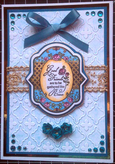
Good Friends Card

Today I made a card with one of my new JustRite Stamps Spring Rose Medallions, and cut it with JustRite's matching custom Die.

I wanted to try the technique where you brayer the color onto your embossing folder and then emboss. I've tried this before, but wasn't terribly successful. I was thinking it was done with Distress alcohol inks, so I dug out my blue one, (I think it's called broken china, it's at work, so I can't look right now), and brayered it onto one of my M-Bossabilities folders. Well, it barely colored the paper, so I washed my EF with soap and water, but it stayed blue. I dried the EF and tried the same shade of blue stain. The kind with the dauber on top. I lined the same sheet of paper up carefully in the same EF and embossed again. The color was a little darker this time, at least you could tell I did something. Then washed my brayer and my permanently blue EF again. I have no idea how to get the blue out, I didn't want to use anything stronger than dish washing liquid. Maybe I didn't use the right kind of ink, because I thought everyone else's EFs came out clean when they did this.

The medallion was colored with Copics. I think I am getting a little better at this. I've made a lot of messes with Copics because I'm not used to those huge tips on them, but I'm quite happy with this one. The center isn't as pale as I would have liked, but I don't have very many colors yet, so I used my lightest golden yellow, and tried to shade and lighten it with colorless blender. Now that it's done, I kind of like the color.

The medallion and card background are mounted on blue Core'dinations. The medallion is outlined with Krylon 18 Karat, and the blue on the background is mounted on gold mirror card. The rhinestones are K&Co, and the blue ribbon is Ofray. The little blue flowers are some I made with little recollections flowers scrunched up and glued together with gold centers added. The gold lace ribbon is some I bought by the yard a while ago. I don't know what kind it is.

Wednesday, June 13, 2012

Bluebird Easel Card ODBDSLC111

When I received this stamp and die set yesterday, I knew I was going to have to enter another card into Our Daily Bread Designs ODBDSLC111 Something Old, Something New, Something Borrowed or Given, Something Blue Challenge.

I used my new ODBD He Watches Me stamp set to make a bluebird with a yellow thistle, then cut it with my new ODBD Sparrow custom die. (I wrote a brief review about how easy it is to use these dies and how much I love using them here).

I cut some old pink, white, and green paper with my old Spellbinders Grand Labels Four die. The patterned paper is from K&Co. The lacy circle is a Marianne creatable, and the circle inside is some old handmade paper mounted onto old white CS using my old Xyron, and cut out with an old Spellbinders circle die.

The center piece, bird and label are mounted with dimensional tape my mother gave me, and the pearls are Queen and Co which my mother also gave me. I didn't have a die which fit the saying, so I traced around a Spellbinders Labels Four, holding it just above and just below the saying and cut them out with scissors so they would mirror the shape of the card.

The bird and thistle are colored with Copics, and the label is distressed with Distress Peeled Paint.

I am excited to say that this card was one of the winners at ODBD!

I love these stamp and die sets!!!

A few weeks ago, Our Daily Bread Designs did a review and tutorial about their custom cutting dies and stamp sets. After seeing all of the beautiful examples, I decided I had to have some, so I ordered three sets. I received them yesterday and played with them today for the first time. They are wonderful!

I love them so much I wanted to share them on my blog for those who haven't tried them yet.

The top photo is of the stamp and die packages that I have, with examples of them stamped and cut out.

This photo shows them cut out with the die sets. I'll try to explain how they work so you can see how easy it is to get perfect die cuts every time! (Disclaimer: ODBD didn't compensate me in any way for writing this review. They don't even know I'm doing it. I am writing it because I like them so much I want to share it with all of you).

Anyway, In the die set you get the die and a little acrylic cut out the same size and shape as the die. The acrylic piece is marked where the die will cut. You will notice in the photo that both the acrylic pieces and the die have little circular tabs on each side.

First, you stamp your design. Then you lay the acrylic piece (the side which faces up is marked), over your stamp so all the cut lines will be outside your stamp. It's very easy to see. When you are happy with the placement, you draw little circles in both holes in the circular tabs on the acrylic piece.

Lift the acrylic piece off and put your die over the stamped image with the cutting side face down. (The photo shows it with the cutting side up so you can see what it looks like). Line the holes in the little circular tabs up with the little circles you made, add a little tape to keep the die in place, and run through your cutting machine using the same sandwich you use for Spellbinders or other similar dies.

That's all there is to it, you have a perfectly lined up die cut! It's so much better than trying to fussy cut with scissors, and it also cuts out those little pieces between stems and other things inside the stamped part. As anyone knows, those little interior cuts are difficult and time consuming to make even with a craft knife.

Now I want all the sets! I hope you found this review useful!

Tuesday, June 12, 2012

Double Zig Zag Card JRC_074

I got seven new JustRite Stamp sets, and two JustRite dies today, so I had to make a new card for JustRite Friday Challenge #074 - "Vintage Masculine". I made this card from another wonderful tutorial by Marianne Skjelstad. I wanted a mottled paper for the card and tried to make my own, but it came out terrible. I didn't have anything I liked for the card, so I used two pieces of handmade paper for the backgrounds. I'm not terribly happy with them though.

The top photo shows the card closed.

The lobster is green because it matches the paper better, and here in Maine, we see more green lobsters than red ones, because most of the lobsters we see are uncooked!

Since I used so many different JustRite products, I am listing them at the bottom of the page.

This photo is when you open the card. All the shells are JustRite stamps from the sets listed below.

While the card is open, you lift the flap, and there is a place for a saying.

All the coloring is done with three Copic markers. One brown, one yellow, and colorless blender. The stamping is done with Distress Peeled Paint, and the distressing is done with Antique Linen.

These are the JustRite products I used.

JB-10025 Nested Oval Medallion Labels Dies

JB-03730 Vintage Label & Banner Dies

CL-03645 Oceanside Oval Medallion - Cling

CL-02220 Sea Shell Bay Labels Twenty Two - Cling

CL-03655 At the Beach Oval Medallions - Cling

CR-03710 Anchors Away

I got wonderful things in the mail today!

I got packages from JustRite and Our Daily Bread Designs today!

The ODBD things don't show up very well, but I got three stamp and matching die sets, The fine Flowersoft in Citrus Crush, and a Cheery Lynn die from them.

It is so much fun to have beautiful new card making things!

Monday, June 11, 2012

Ocean Scene ODBDSLC111

I made this card for the Our Daily Bread Designs Challenge, something old, something new, something borrowed or gifted, and something blue.

The old on this card is is the background paper, which is some really old paper I bought years ago. It reminds me of blue clouds on white. The new is the stamp, this is the first time I have used it, and also the die cut and darker blue paper. Something borrowed or gifted is the glue stick I used to hold it together, I borrowed it from my mother, but the stamp could also be considered gifted, since I won it in an ODBD blog hop. Also, my mother bought me the dimensional tape I used to mount the stamp and verse for Christmas, so that was gifted as well. I guess the blue is obvious, since there is a lot of it in my card. Oh yes, my mother bought me the blue Copics for my birthday as well, so those are gifted too!

For this card, I used ODBD's The Mighty Sea. I stamped it with VersaFine ink, and colored it with Copic Markers. For some reason one of the browns in the rocks looks orange in the photo. I'm really happy with the way the rocks in the water look in person. (There really isn't a big orange spot on one of them like it looks in the photo. I wanted them to look wet, and I still don't have any gray Copics, so I colored them with blues first, then went over them with colorless blender a few times. It turned them into more of a bluish gray. Then I colored them with the same middle brown marker as the rocks on the shore. The shading came from the blues I had applied previously, and the brown coloring came out so smoothly blended and shaded with a touch of the same blue as in the water. The rocks on the shore are much closer to the same color as the ones in the water in real life. There is also no orange in any of them. No matter which camera I use, it seems like when photographing cards, nothing is the right color. Mostly it is the red and brown shades I have problems with.

I have no idea of the brand of the white with blue clouds paper, it is at least six years old. The plain blue is Core'dinations, and the white is generic. The die cut shell is K&Co, and the pearls are Queen and Co.

Saturday, June 9, 2012

No Card today, so I'm showing a Room Box

Today was the first nice day we've had for weeks, and my mother and I were really busy at the shop. Some were customers, but we are in a beautiful location, so we have a lot of people who stop by just to visit. Today was one of those days where we barely had five minutes to do anything, and stayed open an hour later than usual. It was a nice change from those long rainy days we were having! :-) I sold nine cards and an easel card box with matchbox drawers. That might not sound like much, but on a tiny island, it was a big day!

My husband built this room box for me, and I painted and decorated it about six years ago. I used stained glass tiles which were cut offs from a bathroom he was renovating for someone, and decorated around those. The whole floor is stained glass, and so are the columns and sections around the fireplace opening. I loosely patterned it after the Malachite Room in the Hermitage in St. Petersburg, Russia, and the green room at Peterhoff.

The gold on the walls, ceiling and furniture are a combination of Dresden paper and metal filigree. I built the furniture and piano from very old House of Miniature and Real Life Miniature kits. The upholstery is silk.

Wild Orchid is giving away more Candy!

This week's Wild Orchid Crafts Candy. Just Click on my link!

Friday, June 8, 2012

Compass Card JRC_074

I made this card for JustRite Friday Challenge #074 - "Vintage Masculine". I wasn't really happy with yesterday's card. It looks beautiful in person because of all the textures, but it doesn't look so great in photographs. This one looks better. I was inspired to create this card by Linda Duke's beautiful ships wheel card, only I like her's much better!.

I used the same handmade paper as I used yesterday, and cut the porthole, (or outside of the compass, whichever it looks like to you), using Spellbinders dies. The first time I did this, I covered it with Glossy Accents to make it shiny, but it started rolling up on me, so I decided to try to dry it with a heat gun. Big Mistake!!! The glossy Accents turned white! So don't dry your glossy Accents with a heat gun! I added a layer of acetate behind the hole, (which is why the compass looks a little cloudy in the photo, it doesn't in real life), and mounted it dimensionally over the compass. The acetate actually gives the impression of looking through the glass of a real compass.

The compass is from JustRite's discontinued Anchors Away set, and colored with water color pencils. I tried it first with Copics, but I just can't get them to work in small spaces. I sure wish the tip was finer. So many people do such beautiful things with them, but I always come up with duds.

I used VersaMagic Aegean Blue to stamp it with, and Anna Griffin Coffee ink for distressing, then used a Martha Stewart anchor punch to punch anchors out of some old textured antique gold CS. I put Glossy Accents over the anchors to give them a dimensional rounded look. The Glossy Accents were still wet when I took the photograph, so they look a little cloudy. Needless to say, I didn't use the heat gun on them!

I have seven new stamp sets and two die sets coming from JustRite, so hopefully soon, you won't be seeing the same stamps on my cards over and over again! I have a lot of their stamps, but most of them are Christmas stamps. I've got all the new nautical sets coming, plus three of their new flowery sets. It will be so much fun to have something new to work with!

Thursday, June 7, 2012

Sailboat and Handmade Paper JRC_074

I saw this beautiful handmade paper at an art supply store and it reminded me of the ocean. It's a mottled teal and green with lots of texture. I made this card very simple because I didn't want to cover the paper up.

I'm entering this into JustRite Friday Challenge #074 - "Vintage Masculine". I'm hoping it's vintage because of all of the texture, natural twine and distressing.

The base card is ivory and the motif is stamped onto the same ivory CS using JustRite's JB-09755 By The Sea Borders & Centers and die cut with JustRite's Custom Die JB-10025 Nested Oval Medallion Labels Dies made by Spellbinders.

The card and motif are matted with the mottled teal paper and a darker teal handmade paper. The motif is mounted dimensionally. The distressing around the motif and card are done with a teal stamp pad from Anna Griffin, and the stamping is Versamagic Aegean Blue. The coloring is done with water color pencils which actually match the paper colors much better in person than they do in the photo. I wanted the coloring to be light and monochromatic so they compliment the paper rather than contrast with it. Rather than smoothing out my coloring with water, I left it rough so it would match the paper texture better. The only embellishments I used were these two hemp square knots.

Wednesday, June 6, 2012

Ship and Shells Easel Card JRC_074

I think I finally got a vintage card! This is for JustRite Friday Challenge #074 - "Vintage Masculine". For this challenge, I used JustRite's discontinued You Are My Anchor set for the medallion above the ship, and JustRite's JB-09755 By The Sea Borders & Centers for the shell medallion at the bottom of the easel.

I am so happy, when I first posted this, I was afraid my new stamps had been delivered to someone else. I just found out from the wonderful people at JustRite that there had been a delay in sending them because they are moving from Illinois to Virginia. They were sent out two days ago, so I should be receiving them any time now. I can't wait to see them!!!

The DP and die cuts are K&Co, and the ink used for stamping and distressing is Anna Griffin Chocolate. For some reason the distressing on the boat looks orange in my photograph, but it looks brown on the cards. It is the same ink that I used to distress the card and medallions. The boat and shells have too much red and orange in them in the photo too. The whole card is much more brown than this.

Shell Card

This was going to be my second entry for JustRite's current challenge. It started out vintage, but didn't end up that way, so I'm not entering it.

I used JustRite's By The Sea set and K&Co DP. The medallion is cut with JustRite's Nested Oval Medallion Labels Dies. The paper I used for matting the medallion and DP is from a stack I bought years ago, but I don't remember who made it. It matched the colors in the DP perfectly.

The distressing and stamping were done with Anna Griffin Chocolate, and the die cuts are K&Co. The distressing isn't really orange like it looks in the photo.

Tuesday, June 5, 2012

You Are My Anchor Quad Easel Card

Originally I was making this for the latest JustRite Challenge, but when I picked everything out and looked at it all together, I liked it, so I couldn't bear to do anything else with it. The challenge is a vintage masculine card, and there is nothing vintage about my card, so I'm not entering this one, but I wanted to post it on my blog anyway. The top photo is the card closed.

This Photo is the card from the top, and the photos below show the card from each side.

I used the discontinued You Are My Anchor set from JustRite. There were so many wonderful sayings in this set to let a man know just how much he means to you.

Monday, June 4, 2012

Since I don't have a card, here's a doll house

Since I haven't got a card to post, I thought some of you might be interested in seeing one of my dollhouses.

I built this one for my granddaughter 7 years ago. It is the San Franciscan by a company called Duracraft, which went out of business around the time that I bought it. It has six rooms, and is suppose to resemble the painted ladies of San Fransisco.

I have built a ton of houses and room boxes, but unfortunately they are very large, and I was running out of room to keep them in. Right now they are all in my shop. Anyway, between the expense and the amount of room they take up, I haven't worked on any miniatures for a couple of years.

I make all the furniture and accessories in them. A lot of them have scrapbook paper for wallpaper, and scrapbook borders for wallpaper borders. All of the floors are wood veneer I stripped myself.

I hope you enjoy seeing this.

Why I've been MIA for a couple of days

Yesterday at the Supermarket someone backed out of his parking space right into the side of my brand new GMC Sierra. They creamed the whole side of it. Luckily, no one was injured, but since I have only had very very old used cards with over 100,000 miles on them, it was very upsetting. My Sierra only had 5,000 miles when I got it a few months ago, and I was so careful with it. (Since I live on an island in Maine, most women here drive 4x4 trucks just so we can get around in the winter when it is slippery, and in the spring when the pot holes are so big you can't drive a regular car in some places on the island). Here, Sierras and Silverados are women's trucks! :-)

Anyway, it was really late when we finally got home last night and I was terribly upset. The guy left the scene of the accident. (Probably because he was on his cell phone when he backed out and didn't look to see that we were behind him). Luckily the police gave us his information, and his Insurance company sounds helpful. Our insurance company also has all the info and is ready to help if we have problems. Hopefully we will get satisfaction from his company though, since we have a big deductible.

The dealership where we bought the truck, Varneys in Bangor Maine, was also helpful, and got us in with the repair shop they use, so we will probably use them. We have an extended cab truck, and the back door is completely creamed, the front door has damage and the back side of the pickup bed is messed up. The other guy had a Jeep Wrangler with a big spare tire on the back, and his vehicle was undamaged.

Then we got home, and the phone lines are down here, so the insurance companies can't call us. (No cellhone towers here either). We do have intermittent internet, so I've been using that for as long as it lasts. I sure hope the phone lines come back soon, and we don't completely lose the internet.

Anyway, it could have been worse, since no one was hurt, and both he and we have good insurance companies. Things seem better today than they did last night!

Friday, June 1, 2012

PSX Portland Head Light Stamped and Painted

I started making another card this morning, but it was so nice out I decided to do something I could make outdoors instead. I painted the bottom of this wooden box with Barn red, and the top with sky blue. Then I stamped one of my old PSX stamps on it, and painted the stamp with acrylic paint with a medium added so it would be more of a wash than an opaque painted effect.

I used Stazon to stamp it because I knew the paint and varnish wouldn't affect the Stazon. The box wasn't rough, and I sanded it, but the label in the bottom corner didn't quite cover. I decided to leave it as it is because I was afraid I would mess it up if I tried to fix it.

Everything in the gift shop my mother and I run is made by us, so sometimes I have to do something besides a card, and I thought this came out rather nice. I just have to varnish it and clean up the latch a bit and it will be done.